Design
Wrapper’s Delight
This summer finds us on the other side of one of the worst cold and flu seasons of recent memory. I’ve exhausted at least three bags of Halls cough drops, and if by this point I don’t feel healthy exactly, I feel… excited! Pumped! Keyed up! There is, after all, “a pep talk in every drop,” or a clever series of epigrams fitted onto the wrapper of each mentholated candy. The wrappers are littered with pithy one-liners imploring us to “get through it,” “go for it,” and to “get back in there champ!”—sans-serif missives meant to be as restorative as the medicine itself.
The candy wrapper is not a new medium for design. The trompe-l’oeil needlework on the Whitman’s Sampler® box has tugged at heartstrings since the early twentieth century, and Salvador Dalí created the blockbuster Chupa Chups logo for lollipop tycoon Enric Bernat in 1969. The daisy-shaped emblem, bold lettering, and bright stripes in Catalan colors continue to entice children today, and the logo finds a semi-ironic home on everything from shirts and bags to helmets and umbrellas—there is even a “Chupa Chups Universe” website to license the logo, if you’re feeling entrepreneurial.
And it’s no surprise that candy companies see the sales potential in good design. Sweets are often grouped en masse in the checkout aisle, inviting purchase through impulse. Bright colors sell fruity offerings like Skittles® or Starbursts®, while varying shades of brown wrappers denote chocolate confections. Perhaps the most effective design elements, however, are the ones only seen after the point of purchase, those on interior wrappers.

Altoids’ “curiously strong” mints, Dove chocolates, and even the aforementioned cough drops deploy interior surprises that entice consumers to have just one more. Let’s call this the Fortune Cookie Effect. The FCE encourages the consumer to reach for another piece of Dove “Promises” because the wrapper’s inspirational interior messages suggest permission to indulge oneself. Designed like a love letter, the wrappers contain mawkish morsels of advice to encourage binge snackers, reminding the consumer to “Savor every happy moment” or to “Push yourself to notice the extraordinary in the ordinary.” I know consumers take notice: websites collect the quotes, and I carry “If they can do it, you know you can” in my wallet.
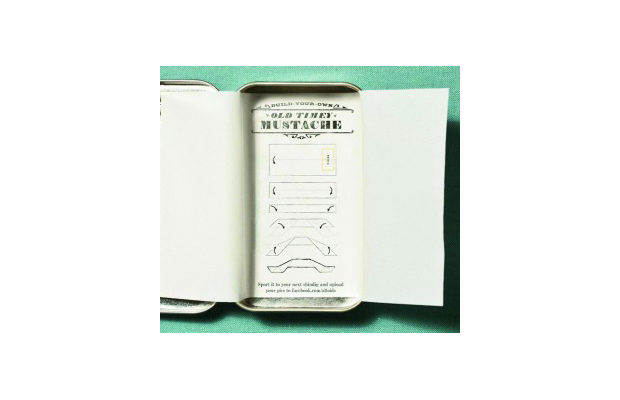
Candy wrappers being what they are, archival information is scarce, but Altoids must be among the earliest adopters of sharing extra information with those consumers savvy enough to make a purchase. The well-known Altoids tins have been in use since the 1920s, and until recently parchment paper liners told the story of the mint’s George III-era history. The package design allowed modern-day consumers to share in the brand’s long Anglo heritage and, by extension, prestige. Recently, the liner’s messages have shifted to reflect a hipper aesthetic, using circus-like typefaces and graphics to introduce random and weird “curiously strong facts.” Did you know “Altoids were once used to ease everything from stomach ailments to raven attacks”? Incidentally, the paper liner can also be repurposed as a dunce cap for your misbehaving hamster.
This humorous specificity acts as a signal to consumers that each tin is unique and encourages them to collect multiple versions of the same product. In this way, mints or chocolates can become more than the sum of their parts, with well-designed packaging picking up where cream-filled centers leave off.


