Feature
Paul Rand: Graphic Impact

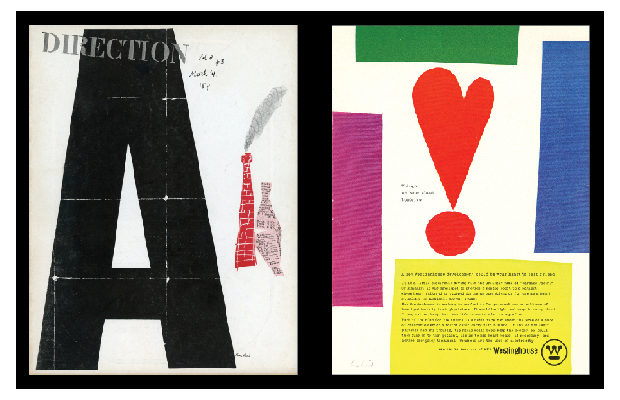
Direction magazine cover, March 1939.
When Paul Rand died on November 26, 1996, at eighty-two, his career had spanned six decades, three generations, and numerous chapters of design history. In the late 1930s he began to transform commercial art from craft to profession. By the early 1940s he had influenced the look of advertising, books, and magazine cover design. By the late 1940s he was proffering a graphic design vocabulary based on pure form where once only style and technique prevailed. By the mid-1950s he was altering the ways that major corporations used graphic identity. And by the mid-1960s he had created some of the world’s most enduring corporate logos, including IBM, UPS, ABC, and Westinghouse. He was the channel through which European modern art and design—Russian constructivism, Dutch De Stijl, and the German Bauhaus—were introduced to American commercial art. His first of four books, Thoughts on Design, published in 1947 when he was thirty-two, was a bible of modernism. In his later years he was a teacher, theorist, and philosopher of design.
“It is in symbolic, visual terms that the designer ultimately realizes his perceptions and experiences; and it is in a world of symbols that man lives.” –Paul Rand
2014 marked Rand’s one hundredth birthday, and on February 25, 2015, the Museum of the City of New York opened the first major museum exhibition of his contributions to New York design. Curated by Donald Albrecht (I am a co-chair of the show), the exhibition takes off from an earlier solo retrospective at the Museum of Design Atlanta (MODA) organized by Daniel Lewandowski, who runs the Paul Rand website (paul-rand.com).

Trained in the commercial art bullpens of New York’s publishing and advertising industries, Paul Rand (born Peretz Rosenbaum but Paul Rand was more balanced) was critical of the poor aesthetic standards that prevailed. He modeled himself on such avant-garde artists as painter Paul Klee, designer El Lissitzky, and architect Le Corbusier, each of whom advocated a timeless spirit in design. Adhering to Le Corbusier’s dictum that “to be modern is not a fashion, it is a state,” Rand devoted his life to making what he modestly called “good work.”
Graphic design—which fulfills aesthetic needs, complies with the laws of form and the exigencies of two-dimensional space; which speaks in semiotics, sans-serifs, and geometrics; which abstracts, transforms, translates, rotates, dilates, repeats, mirrors, groups, and regroups—is not good design if it is irrelevant. –P. R.

Westinghouse magazine advertisement, 1961.
Looking to the European moderns for inspiration, he developed a fresh and individual approach to visual communications. His magazine and advertising layouts wed functional simplicity to abstract complexity. Void of ornament, each detail was planned to attract the eye and convey a message. Yet nothing was formulaic.
The page was a stage on which Rand performed feats of artistic virtuosity. His work was so distinct from that of both his traditional and faddish contemporaries—so radically counter to the accepted norms yet progressive in ways that tested the limits of print design—that his admirers called him the “Picasso of Graphic Design.”

I Know a Lot of Things, book designed by Paul Rand and written by Ann and Paul Rand, 1956. Jazzways magazine, 1946. Courtesy of MCNY.
“The Coronet Brandy advertisements are based on a common object—the brandy snifter—in animated form. The dot pattern of the soda bottle was designed to suggest effervescence; the dotted background, in turn, is a visual extension of the bottle; the waiter is a variation of the snifter glass; the oval tray individualizes for Coronet the silver tray we used to see in liquor advertisements.” –P. R.

Coronet Brandy magazine advertisement, 1943.
For the rest of his career, he lived up to that distinction. His work covered a broad range from advertising to book covers, from children’s books to corporate identity. He was not the first designer to create modern logos, but he was the most invested in making the logo more than a mere trademark. Much of his work, and especially his logos and marks, are as fresh now as they were then. Most of them are still used (IBM, Westinghouse, ABC, Morningstar)—UPS has altered theirs for the worse.
Even more significant are the words that Rand lived by—the writing he did in later life in books and articles—that defined modern design and the modernist designer. Paul Rand the writer, however, is another story. Here we look at the enduring designs that first made him famous.
Steven Heller has taught at the School of Visual Arts in New York for more than twenty-five years and is co-founder of two of the school’s MFA programs, Design Criticism and Designer as Author. He is the author/co-author of 170 books, including Paul Rand (Phaidon Press).
Except as noted, all images courtesy of DANIEL Lewandowski / paul-rand.com