Feature
For the Love of Plywood
A studied metamorphosis

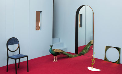
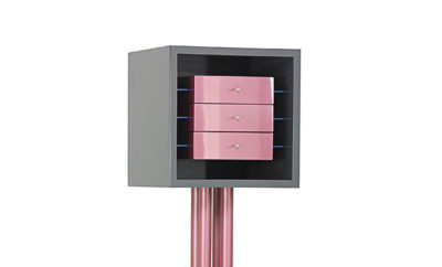
Designed with plywood floors and walls the new director’s office at the Palos Verdes Art Center is a riff on California modernism. On the custom-designed plywood wall-hung cabinet is a collection of Shearwater pottery; above hangs Tower and Surf Boards, 1952, by Davis Miller (1917– 2012), PVAC’s 1952 “Purchase Prize” winner. (Clarke Henry photos)
TWO YEARS AGO I BEGAN A CALIFORNIA DESIGN ODYSSEY. What started out as a relatively small project (the design of administrative offices for an eighty-plus-year-old California art institution, Palos Verdes Art Center—PVAC) turned out to be an all-encompassing dream project that included not only the reconfiguration and design of the administrative offices, but also of the lobby, galleries, gift shop, logo, banners, and invitations; developing a cafe; researching and establishing a permanent collection; curating ten exhibitions; creating the scenography and design for fourteen exhibitions; creating three seventy-page catalogues; and developing pop-up shops, project space, and site-specific works within the center.
What started out as a relatively small project turned into an all-consuming redesign of the Palos Verdes Art Center
The director, Joe Baker, pulled me into this project bit by bit. I had previously worked with him in New Orleans where he was director of Longue Vue House and Garden; he had given the house over to my brother Gene and me for what he called an “intervention”—in which we designed and incorporated thirty years of our work into the house and its outbuildings. By the end of the run of the Longue Vue show, Joe announced that he was taking a new position in California as the director of PVAC. He flew me from New York, where I live and work, to Los Angeles (Palos Verdes is south of L.A. proper but within the metro area) in March 2013 to “have a look.” Initially, he asked me just to design the administrative offices, but I quickly realized that more things (many, many more things) were needed in order to make the spaces and center function properly. (I have a tendency to overload my plate—fortunately I love being too busy, it makes me more creative.)

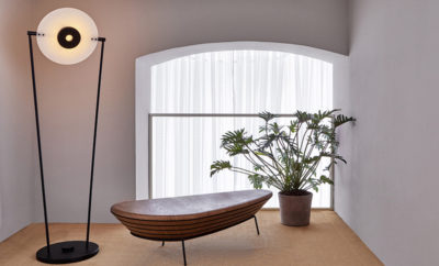
A fiberglass Charles and Ray Eames low rod Shell armchair from Modernica in Los Angeles stands near an Eames Compact sofa that was rediscovered after decades in storage and reupholstered in a Knoll fabric. A suite of 3-D paper reliefs dated 1968 by Herman L. Renger hangs above the sofa.
Some of the treasures I found in the storage space set the tone for the entire project
My first trip was really a discovery mission: I got a great rush rummaging through storage spaces that had accumulated decades and decades worth of the life of an arts institution that was not, for the most part, intended to be a collecting institution. Some of the treasures I found influenced and set the tone for the entire project. The first was the forgotten set of Eugene Sturman doors—the original doors to the center’s current building, which dates to 1982. (Around the same time Sturman created a monumental hanging sculpture, White Dwarf/Cellular Vortex, that was installed at the Otis Art Institute’s main entrance, part of the MacArthur Park Public Art Program.) The next find was an Eames Compact sofa (purchased by PVAC in 1959), though its original black leather upholstery and foam filling had deteriorated. Another storage area began to reveal fifty years of “Purchase Prizes”—works by California artists that PVAC had acquired, one work every year, from a juried invitational beginning in 1942. Highlights included pieces by Sturman, John Altoon, Betty Gold, Davis Miller, Paul Darrow, Herman L. Renger, Peter Max, John Sloan, and Rufino Tamayo.
On each trip to Palos Verdes I ferreted out more and more gems. Although PVAC is still not a collecting institution, I felt it important to put these works on permanent view in the administrative offices with detailed wall labels explaining the history of the artist and the work. My early years in the art world (specifically at Holly Solomon and Metro Pictures) had taught me a love of exhibition presentations, from hanging to labeling—a whole art in itself. And because the core of the collection was California artists it seemed only natural to do a riff on California modernism and incorporate plywood as a key element in the design.

For the new staff office I designed a freestanding angled wall covered on four sides with teal mirrored plexiglass, which conceals a storage area for office supplies. The Coral Pendant hanging light by David Trubridge is made of bamboo plywood. H-base Eames side chairs from Modernica, each in a different color, surround the conference and work table by Restoration Hardware. On the table is a collection of pochoirs from Derriére le Miroir #221 by Alexander Calder, 1976. The oil painting above the desk is Southwest Mountains by Paul Gardner Darrow, the 1956 PVAC “Purchase Prize” winner.
The work of Ray and Charles Eames in the 1940s and the California Case Study houses—specifically numbers 1, 11, and 20—all used plywood in revolutionary ways. They became the starting point for the administrative and director’s offices. I had always wanted to create a space with plywood, but for whatever reasons it was never the right space/ place/time until now. I find plywood to be what I refer to as a comfort material: it is something my generation had grown up with and so was recognizable and accessible (and besides all that I love the organic patterns of the grain). Likewise, I’ve always liked spaces and objects to have a purpose; it’s not about pretty—it’s about a concept, and in this case design follows concept. I also love things that actually look utilitarian; I find in our current time that looking useful is actually the new way to adorn a space.
The PVAC staff had been working for several decades in cubicles that looked like the Eastern Airlines corporate offices in 1970. We moved the staff offices from the north building basement into what had been the printmaking studios, which were centrally located in the main building, and created new access into the galleries from them. Key staff was moved to a new front office and redesigned lobby. An oversized upper gallery was divided in half. An artists cooperative/gift shop that has been at PVAC for more than twenty-five years was relocated into the back half of the upper gallery, placed there not just because it flowed with the space but because it truly fulfills the phrase “exit through the gift shop.”

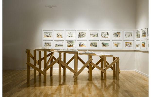
One of my favorite exhibitions was Floating Man: The Sketchbook Drawings of David Rinehart (July 25– September 7, 2014); the display of Rinehart’s architectural models was created out of two-by-fours and plywood.
As I was creating the new spaces at PVAC, I got drawn into the planning of exhibitions as well. Joe Baker confided that part of his strategy for reinventing the center was an aggressive exhibition schedule. Shows would be changed out every six to eight weeks, with a three-week installation period. I love working and creating in short time frames—and since I can wear many hats this idea intrigued me: the concept and development of an exhibition, the schematics and design development, final designs, construction documents, fabrication, and the installation. Tight budgets are the mother of invention. Further, I saw this as a way to craft a singular message, using utilitarian materials throughout the exhibitions (and echoing the “plywood palace” I was already creating). The head preparator Aaron Shepard, an artist himself, is a genius at installation and the fabricating of the designs.
One of my favorite exhibitions was Floating Man: The Sketchbook Drawings of David Rinehart. A student under the renowned Louis I. Kahn at the University of Pennsylvania, Rinehart worked for several years in Kahn’s office. His most notable building is the east wing of the Salk Institute in La Jolla, California. Rinehart completed the sketchbooks exhibited during the first eleven months after being diagnosed with Alzheimer’s disease. Having had both my parents and grandmother afflicted with Alzheimer’s I wanted to create a fitting tribute. I designed many layers into the exhibition—for the catalogue I walked a tightrope conveying his career, life, the effects of the disease, and his forty-plus-year relationship with his partner Tony Rasmussen. I created all the displays out of regular building materials—mainly two-by-fours and plywood—the largest and central element being a twenty-six-foot-long display case that housed the four sketchbooks that made up the bulk of the exhibition. The case appeared almost like a bridge and was angled from the center of the gallery into a corner. As you walked down each side to view the pages you ran into the corner wall—forcing you to take a few moments to get reoriented to walking back and around to see the rest—not unlike moments of Alzheimer’s.
The idea of a permanent drip painting became the motif for the Stripe Cafe

My Drip #124 painting in the Stripe Cafe measures forty-two feet long in total (this view shows a fourteen-foot section). The fiberglass Eames Shell chairs with Eiffel bases are from Modernica.
My final tribute was to create a site-specific dining room for the opening night dinner. I spent five days building the silver sheathed room— then three days painting one of my “drip paintings” (my largest to date at eighty-nine feet long). I used twenty gallons of paint, 6,850 Legos, twenty-five four-by-eight foot sheets of insulation, and 815 feet of silver insulation tape to complete the space. (I began doing what I refer to as “drip paintings” my junior year as a fine arts major at Parsons School of Design. I am fascinated with the spontaneity and lyrical gestures created when I pour/drip paint—strips of color that sometimes bleed into one another or flow down the surface to create complex and beautiful details.)
Construction on the cafe began in August. The Rinehart dining space was the inspiration for the final design. I have always loved museum restaurants (my favorite being Terrace 5 at New York’s MoMA— I try and have lunch there twice a week); for me there is an energy level and a quiet respect that surrounds museum cafes. I had originally named the PVAC cafe Stripe based on an early design concept, but even though I abandoned that idea, I thought the space still had to visually say “stripe” somehow. So the idea of a permanent drip painting on the main wall (forty-two feet long) became the new motif. However, I wanted to do something new so I created three layers of drips—the first was the entire wall, which I covered in opaque white plexi and then dripped; next I dripped ten four-by-eight-foot sheets of one-quarter-inch plexi panels on both sides. Using floaters, the panels were then attached one and a half inches off the white plexi wall. The three levels of drips created a beautiful veiled effect. The main dining room was all white: walls (all sheathed in white plexi and attached with screws and washers and trimmed out in metal millwork—Tommi Parzinger’s iconic silver stud–adorned cabinets of the 1950s were the inspiration); floors (1960s-style speckled Armstrong tiles); ceiling; and tables and chairs (once again pulling in the California modernist theme with white Eames fiberglass chairs custom ordered from Modernica in Los Angeles). The front and back entrances and service areas (which sandwich the white space) are sheathed in particleboard with a matching speckled floor. The space has three large skylights, which, with the California light, actually made it too bright: it needed to be diffused. I designed hanging light sculptures created out of hundreds and hundreds of sheets of clear heavy-gauge vinyl in five different colors. For the bar area I once again used mirrored plexi. I found an old “Bar” sign at the Chelsea Flea Market one Sunday in New York, and the odd colors against the blue mirror were kind of perfect—a Jack Pierson moment. Plus, I have a fascination with constellations, so all twelve zodiacal constellations are subtly created with screws and washers of various sizes screwed into the mirror (I love to make a simple and edited element and create an odd imperfection within it). I titled the bar “Twinkle Twinkle Little Bar.”

This photo shows me in the site-specific dining room I created for the David Rinehart dinner.
The completion of the Stripe Cafe was the final piece in my two-year design odyssey in California. Maybe now I can get some sleep— my biggest regret after more than sixteen round-trip flights from New York to Los Angeles (approximately seventy-six thousand miles) is that I have still not earned Mosaic status on JetBlue.