Design
Mind Your Manors

Mind Your Manors
Long gone are the “if you’ve got it, flaunt it” days when shelter magazines, as well as television programs such as Lifestyles of the Rich and Famous, showcased houses built to manifest conspicuous wealth, rather than a pronounced design sensibility. Now that the economy has spawned a climate of restraint, there’s widespread discomfort toward “money talks” decors. And if an even slightly ostentatious interior sneaks its way into print, it’s justified as evidence of “a life well lived,” and anything “grand” is made palatable by an adjunct term like “ancestral” or “European.” In current magazine parlance “down” is a commendable descriptive for the design choices of the upwardly mobile. Discerning couples “downsize,” or at least “downplay,” their house’s large scale. Their goal is “pared down luxury.” The upholstery in a formal room is “dressed down” so that it qualifies as “understated chic.”
Fact is, an interior design magazine that sustains itself on a visually white-bread diet of modest Spartan interiors lacks luster and soul. Issue after issue of modern prefab houses filled with flat-pack furniture, beanbags, and plastic milk crates is aesthetic gruel. The exuberance of a hunter-gatherer’s home; a fearless use of color and pattern; or the over-the-top ingenuity of a designer like Tony Duquette—whose exotic furnishings treated excess as an art form—are the spice of life. Such decors are a desirable indulgence on par with a rich dessert—and they rarely have anything to do with money. They stem from passion and originality.
Interior design magazines are commonly seen as documents of the design status quo. Most of us assume their stories feature whatever the editorial staff uncovers in a decorator or architect’s portfolio. In truth, a publication may ship in a truckload of furnishings to sharpen up a homeowner’s taste, meet an editorial agenda, or appease an advertiser or two. Potential editorial coverage may affect how a designer creates an interior, especially when he or she is aware that editors are always on the lookout for “wow” factors in any scouting photos they review. It arguably goes back to Syrie Maugham, who in 1927 concocted the first entirely white room. As legend has it, she did so out of a desire to satiate editor pals and drum up some controversy that would reel in new clients once the story hit the newsstands.
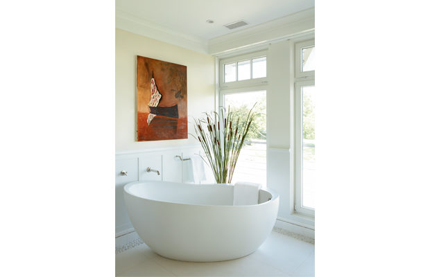
When a particular appliance, piece of furniture, or pendant light proves to be photogenic and is widely published, it can become iconic. Case in point: the fixture du jour, the freestanding white bathtub. It’s always oversized and sculptural and is most often installed adjacent to a window with a stunning view beyond. Anything but restrained, the tub costs big bucks, weighs a ton, commands a lot of space, and consumes more than its fair share of resources. Ironically it often ends up in the master bathrooms of people who have an eye for dramatic focal points, but who freely admit they really prefer to take showers. But boy, does that tub photograph well.


