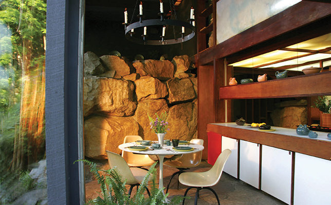
 Wright loved the way boulders on his property were naturally massed into sculptural forms. In the dining area he built up a wall of natural rock that contrasts against the kitchen’s Formica cabinets trimmed with white oak. Photo by Tara Wing.
Design
The Wright Stuff: Manitoga
TWENTIETH-CENTURY DESIGNER RUSSEL WRIGHT arranged the footpaths cutting through the woodlands of his property in Garrison, New York, to be filled with small surprises. From up high, you look down to a sliver of meadow or find yourself walking beside carpets of moss. When you get to a cluster of cascading ferns, you hear a waterfall hidden behind a screen of trees. Wright’s house and studio, with low flat roofs planted with sedum, are situated as discreetly as swallows’ nests on the ledge of a cliff. They come shyly into your field of vision and vanish as you walk along. Though you might feel a flutter of excitement, it’s not about the view so much as a growing intimacy with the setting. That was Wright’s plan, to direct his guests to experience the natural world as part of his work of “living art”—the modern house, studio, and wilderness garden he named Manitoga, today a National Historic Landmark.
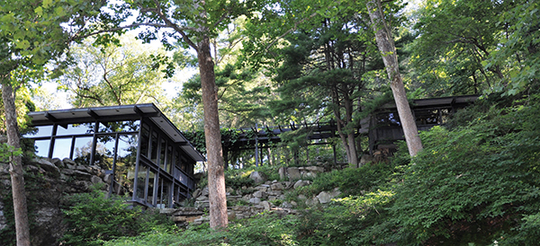
The long, low structure of Russel Wright’s house and studio, connected by a vine-draped pergola, was built into the side of a cliff with terraced granite steps leading out to the quarry pond and its waterfall. Vivian Linares Photos
As a young man, Wright worked as a theatrical set designer but he became famous as an industrial designer of organically styled modern furniture and housewares. His 1932 so-called “pony chair” was used by board members at the Museum of Modern Art before being transferred into the permanent collection in 1958, and more than eighty million plates, cups, and saucers from his American Modern dishware line were manufactured between 1939 and 1959.
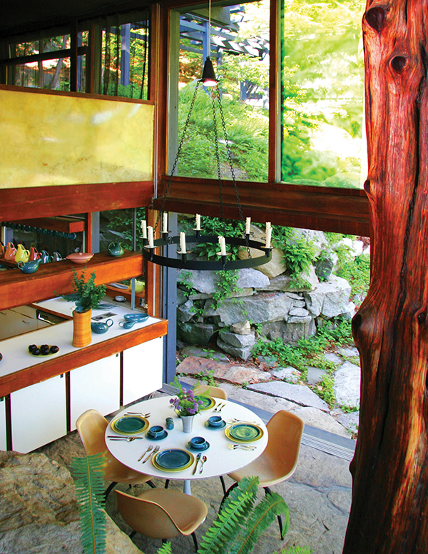
Looking down at the kitchen and dining area, you notice how Wright blended and contrasted man-made and natural materials, including the enormous cedar tree trunk he installed for vertical support. The wrought-iron chandelier was designed to be raised and lowered with a pulley so you could light the candles and then adjust the height. Modified Eames chairs surround the table set with Wright’s American Modern tableware and his signature salt and pepper shakers. Photo by Tara Wing.
In 1942 Wright and his wife, Mary, herself a designer and sculptor, purchased seventy-seven acres in Garrison that included an abandoned quarry and adjacent hillside covered with second-growth forest—the land having been clear cut for logging in the 1800s—as well as a hodgepodge of brambles, rocks, and vines. It was their intention to use the place as a weekend retreat, staying in a small shack on the property until they built a house that would reflect their experiences in theater and design. As Wright began repairing the scarred landscape, he became one of the pioneers of American environmental practice, shaping the woodlands while preserving the human history of the site, even leaving iron quarry-cable hooks in the rocks. He dammed up the old quarry and reoriented a mountain stream to fill it for swimming. He dynamited ledges of granite to make steps for a waterfall. Gradually, he began cutting vistas, making room for selected plants that he discovered on the property and cultivated, and allowing hemlock and gray birch to grow in stands with mountain laurel and wildflowers flourishing underneath.
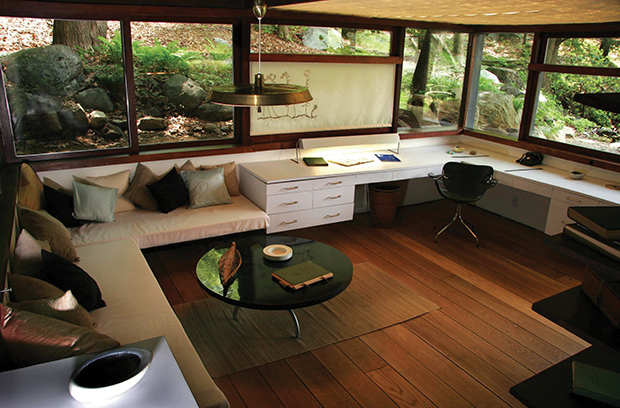
Wright spoke about “the worm’s eye view” from his studio set low into the bank of a hill. Seated in his George Nelson Swag Leg chair for Herman Miller at his white Formica drafting desk, he could look out at his woodland garden or lower the shantung window shades, hand-drawn by the artist Hector Leonardi who worked as his assistant in his New York City office. Photo by Tara Wing.
In 1950, the same year they adopted their daughter Annie, the Wrights published Guide to Easier Living with ideas for a modern, efficient, and casual lifestyle. They intended Manitoga to be their laboratory, but Mary died in 1952, leaving Russel in transformed circumstances with an unfinished project. Because he had come to love the property, he continued to sketch concepts for an idiosyncratic and highly individualized house for himself, his daughter, and their housekeeper. He wanted sleeping quarters situated in opposite wings of a central living space, with his bedroom and studio connected to the main house by a wooden pergola, and he wanted the structures to fit respectfully into the land. In the mid-1950s, he hired David Leavitt, an architect who had worked on major projects in postwar Tokyo and was known for a Japanese approach to American architecture. According to their agreement, following the outlines of Wright’s general plan, Leavitt would be responsible for the exterior while Wright served as general contractor and interior designer. Years later, Leavitt called it a “once-in-a-lifetime dream commission.” The multilevel complex they constructed—the main house and studio together—is sited into the edge of the quarry, with sliding Thermopane doors extending along granite slab terraces rising off the quarry pool. From certain angles, the house almost disappears, or, rather, turns into a clear container showcasing both the rugged sculptural fireplace made with uncut boulders that Wright referred to as the “burning heart of the house” and the principal structural support, a cedar tree stripped of its bark, rising off the flagstone floor of the living and dining areas. From other vantage points, the quarry pool, its stones, and the surrounding woodlands reflect onto the glass as in a mirror.
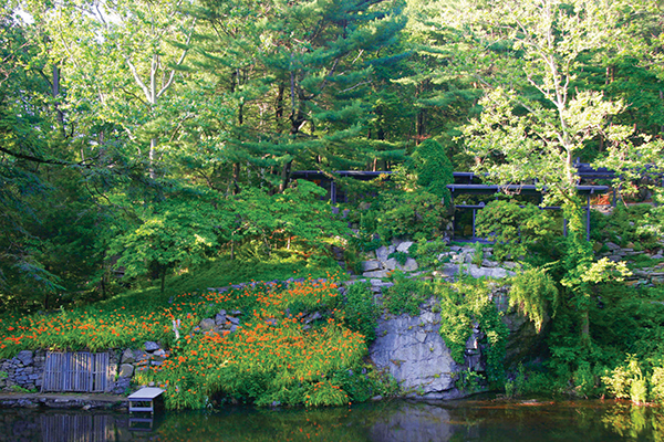
Wright planted hundreds of daylilies along the sloping quarry wall. In early July, when they popped with color, he would bring guests out to see their blooms and celebrate with fireworks. Photo by Tara Wing.
Wright filled the interior with objects that he designed, collected, adapted, and even handmade. In his study are a simple Formica table he designed with a circular top that revolves like a lazy Susan and a Valet chair by Hans Wegner. In the dining area, Eames chairs were adjusted to stand on three legs rather than four, so they would rest better on the uneven stone floor.
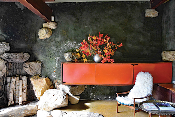
Wright called the massive fireplace in the living room the “burning heart of the house” and constructed it with an opening large enough to accommodate four-foot logs standing on end. He designed and built the wood and laminate-veneer storage cabinet, which seems to float in space. Photo by Vivian Linares.
Wright enthusiastically experimented with unexpected combinations of natural materials and synthetic ones with which he had become familiar during his years in industrial design. He fused pine needles and epoxy resin for one ceiling treatment and he embedded pressed butterflies brought back from Brazil and Taiwan in a translucent sliding door panel for Annie’s bathroom—where she hung her towels on the upright branch of a dogwood tree. Every room linked to the outside with private patios and terraces. He designed the windows in his studio to slide down into the walls so that he could feel himself directly in the garden while working at his desk. The kitchen and dining area were conceived for modern efficiency, divided by a long cabinet with doors opening on both sides. Above the Formica countertop, Wright built an ingenious movable cupboard that could be raised so one could look out to the landscape while cooking. In Japanese fashion, he changed the fabrics, dishes, and even artwork according to the seasons—reds, browns, and oranges for winter contrasted with blues and greens in warm weather. Devising it at an optimistic moment in American design, Wright understood his project as a continuous celebration of natural beauty indoors and out. It is a pleasure to visit Manitoga and be reminded of his passion and ideals.
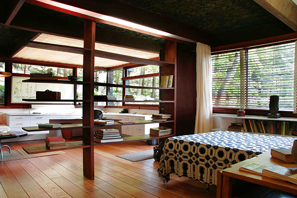
The studio demonstrates Wright’s spare modernism. The work and sleeping areas are divided by an open oak bookshelf that also allows light and air to filter through the space. A curtain can be drawn across the room for greater privacy. The recessed florescent ceiling light is softened and concealed with layers of burlap, plastic, and foil. Photo by Rob Penner.


