 Enigma of Aldo Tura
Design
The Enigma of Aldo Tura
TROY SEIDMAN EXPLORES THE IDIOSYNCRATIC WORK OF THE ITALIAN DESIGNER KNOWN FOR HIS SUMPTUOUS FINISHES
ON A RECENT PANEL in New York City hosted by MODERN Magazine and sponsored by the Piasa auction house, I was asked one of my favorite questions: “Which twentieth-century designers are under the radar?” “Under the radar,” of course, is open to interpretation—does it mean a designer who is unknown (or underappreciated) or is this simply a euphemism for “currently inexpensive”?
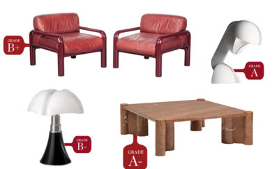
Aldo Tura (1909–1963) satisfies both interpretations. While pieces created during his lifetime or in later years by his atelier are readily available, he is typically omitted from discussions of mid-century Italian or Milanese design, and as a result many works are surprisingly affordable. It is not uncommon to find small tables, bar carts, and, certainly, accessories under $1,000. On the opposite end of the price spectrum, important case pieces can easily be priced in the $10,000 to $25,000 range and beyond.
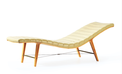
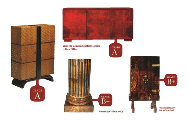
Tura is one of those twentieth-century designers known for their dedication to a specific material—think Alex andre Noll and Sam Maloof (wood), Gabriella Crespi and Paul Evans (metal), or Sheila Hicks (textiles). Tura focused almost exclusively on lacquered goatskin, applying it to an array of glamorous (sometimes kitschy, sometimes elegant) products for the home. Chocolate brown (which at times resembles tortoiseshell) is unquestionably the most common color in Tura’s oeuvre, followed by a dense emerald green. Far less common are creations in red or natural (or partially dyed) hides, while the rarest colors are dark blue and purple. Some of his earlier pieces, particularly from the 1950s and ’60s, include figural panels, though the figural scenes are not always original and include replicas of famous paintings from the Middle Ages to Monet.
The Tura client clearly liked to have a good time. Bars of various sizes and functionality, from delicate rolling carts to large tiered cabinets, seem to have been the studio’s main focus. They were complemented by related accessories—ice buckets, carafes, humidors, ashtrays, and cocktail shakers—all covered in lacquered goatskin. A notable feature of the work, particularly in the ‘50s and ‘60s, is its brass hardware, which ranges in look from vaguely medieval to baroque.
Perhaps one of the reasons there is scant scholarship about Tura is the difficulty of positioning him in relation to modernism. His work is simply too luxe and decorative, too labor intensive, and too interested in historical ornament. Like Piero Fornasetti, he does not fit comfortably within the parameters of Italian modernism; he can be better positioned in relation to the American mid-century designer Tommi Parzinger, who similarly created glamorous (often bespoke) furniture notable for sumptuous finishes and elaborate historical hardware. Gerti Draxler, the esteemed twentieth-century design expert at Dorotheum, the Viennese auction house, suggests that the lack of coverage can also be explained by the fact that, unlike some of his Milanese contemporaries, Tura was not an architect or an interior designer and did not have complete projects documented, published, and evaluated.
Happily, different forces are championing Tura’s work today. Blackman Cruz, an influential and adventurous design dealer in Los Angeles, consistently shows his work. Draxler, who has long been interested in Tura’s work and is credited with developing his secondary market, is working with the Tura company to release vintage pieces to market. If we look at Tura’s auction record, the top ten lots have primarily been achieved in the past two years, most of them hammered down in Vienna. Interestingly, Draxler notes that the majority of Dorotheum’s Tura sales are exported to the United States. Certainly, that the Tura firm is still in operation and maintains an archive of sketchbooks, inventory lists, and vintage pieces will help the designer’s ascending profile and encourage both scholarship and connoisseurship.

WHEN ASSESSING A TURA PIECE there are two factors to consider: the aesthetics of the overall form and the merit of the surface covering. The exceptionality of this striking piece (which has been deservingly popular on Instagram) comes from its dramatic color. Red was not an easy color to realize— Tura’s results frequently being too dark, muddied, or maroon. This luminous console, in a shade reminiscent of an exceptional red wine, possesses a vitality that eclipses the simplicity (or ordinariness) of the form. We can deduce that it was likely made by his studio after Tura’s death, as its minimal shape is similar to that of other clean-lined pieces from the 1970s and beyond. Earlier case pieces, particularly from the 1950s and ‘60s, are characterized by brass hardware, figural panels, or other decorative flourishes. Adam Blackman and David Cruz explain that this console, like most Tura pieces, has held up exceptionally well, its patina becoming richer with time.