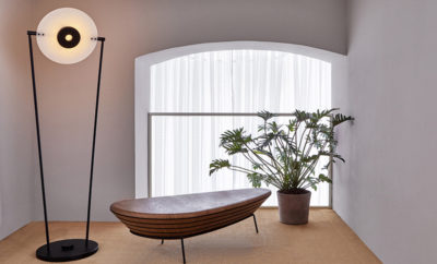
Design
Grading System: Ken Price
Due to a copyright conflict, we are no longer able to include images of Ken Price’s work. Please visit Ken’s website to view more of his works.
TROY SEIDMAN SCRUTINIZES THE OFTEN-AUDACIOUS WORKS IN CLAY AND ON PAPER OF A CERAMIST WHO BROKE THE MOLD
IS KEN PRICE (1935–2012) A BELLWETHER or an anomaly? How does a creator working primarily in ceramics liberate his reputation from the realm of craft/design/pottery and become an artist? The simple answer: with originality, irreverence, and complexity. From the outset, Price’s work was characterized by a rejection of the conventions ceramists subscribe to. He was not only ambivalent about functionality, but, more important, he consistently rejected the symmetrical results that the potter’s wheel produces.
While completing his BFA at the University of Southern California during the 1950s, Price came to know Peter Voulkos, who encouraged him to establish his own aesthetic. While Voulkos is renowned for going large and tall, Price mostly worked on an intimate scale. In the 1970s he dabbled with arrangements of small works that approached installations, but he didn’t create large-scale individual works until the early 2000s.
Price’s eminence results from his surfaces, forms, color, and finish. His best work completely disguises clay’s natural texture and palette. Rather than using traditional glazes, he experimented with acrylic and automotive paints, applying dozens of layers of color and then attacking the multicolor strata with sanding and other abrasive techniques. The results were unlike anything that could have come from a kiln. Particularly in the ‘80s and beyond, Price’s (finest) surfaces looked like speckled Murano glass, melted plastic, or some sort of coral or other marine specimen.
Frequently, collectors and/or institutions prioritize a particular—often early—decade of an artist’s output, but admirers of Price’s work defy this convention. Each decade seems to introduce a new approach and aesthetic. Arguably, Price became more audacious and singular as he aged. He died at seventy-seven in 2012 after a bout with cancer, only a few months before a traveling retrospective (designed by his friend Frank Gehry) opened at the Los Angeles County Museum of Art. Interestingly, the exhibition was presented in reverse chronology, beginning with his latest work.
Up Back • 2000
IN HIS LAST DECADE OR SO, Price propelled his reputation to a new generation of collectors and admirers with some of his most compelling creations. Typical is Up Back, which resists orientation (which is the front, the back?) or easy identification. Is it a melted Muppet? An intergalactic pile of dung? A mutant candy octopus? But the merit (and mystery) of these bulbous forms, reminiscent of Linda Benglis’s poured latex sculptures, goes beyond the weirdness of the shapes; they are admired, too, for the complexity of the finishes and colors that recall Murano glass or even the spray paintings of Jules Olitski. There is also an element of trompe l’oeil, as the pockmarked surfaces appear somewhat abrasive when in fact they are completely smooth. This piece, which appeared on the cover of a Los Angeles Modern Auctions catalogue in October 2015 and sold for $168,750, is a perfect example of Price’s mastery of color, form . . . and playfulness.
Pink Egg • 1964
THIS SMALL WORK COULD MAKE A FABERGÉ EGG envious. The size of a grapefruit, it has a playful yet simple surface, interrupted by a “magic” reveal that exposes a cluster of small but seemingly active forms that look like pickling cucumbers. Though Price was just approaching thirty when he created Pink Egg, it demonstrates many of the hallmarks seen throughout his oeuvre: the kindergarten colors, orifices, and protrusions that are both (or neither) biomorphic and (or) sexual. Many of Price’s sculptures from the 1960s included specially designed bases, platforms, display boxes, or even illuminated mini-vitrines. Pink Egg stands on a white pedestal nearly five feet tall. For better or worse, there isn’t much “design” in the pedestal, so it does not interfere with or influence the egg itself. While predating—though cooperating with—the white-cube aesthetic that defined the late twentieth-century presentation of art and objects, there is something more contemporary, less conspicuously “sixties” about this piece. Not surprisingly it soared beyond its estimate of $300,000–$400,000 and sold for just over half a million dollars at Phillips in 2014, still the artist’s record at auction. Besides its visual curiosity and aesthetic impact, the sculpture is also a paradigm of Price’s importance in the Los Angeles art scene of the 1960s, when he had three solo shows at the legendary Ferus Gallery. Pink Egg debuted there in March 1964.
Iconoclast • 1985
IT WOULD BE HARSH TO CONSIDER THE 1970s as Price’s lost decade, even though I’m confident that most people familiar with his work will agree that his output from his first decade in Taos, New Mexico, with its references to Mexican pottery, was his weakest. The forms are often banal, and the surface decoration, which frequently includes figuration, has not aged well. But in the early 1980s Price got his groove back. His 1983 “Specimen Rocks” began a marathon of inspired production and masterful eccentricity that lasted until his death. The “Two-part rock sculptures” (of which Iconoclast is an example), exhibited in New York and Chicago in 1985, are vaguely rock-like forms with asymmetrical chunks removed from the tops or sides, revealing bold bright colors. Iconoclast could be a geological specimen from a distant universe or a B-movie version of Mars. Or, since biomorphic elements or allusions regularly appear in Price’s work, it could be interpreted as a calcified blood-stained organ recently dissected. This ambiguity is a strength of Price’s works from the 1980s—as is his new expertise in applying acrylics to fired clay.
Untitled • 1991
THE MAJORITY OF PRICE’S SCULPTURES are abstractions, yet, it would be erroneous to consider him an abstract artist. Throughout his career he created figurative scenes through several artistic channels: on functional ceramics and in prints, watercolors, and even paintings. So in assessing his oeuvre, it is essential to include a figurative work. Price had a particular affinity for furniture, interiors, and the patterns of architecture in a landscape. This watercolor is an exemplar of his style—visually indebted to illustration or sophisticated comics, rife with references to urban California (through palm trees or architecture), and a palette that is both familiar and slightly jarring, notably the dirty pastels and pallid earth tones. Other recurring characteristics are the monochromatic coloring of the sky and interior walls and the juxtaposition of red and pink or opposing primary colors. Examples of his two-dimensional works from four decades have appeared on the secondary market, the majority, and finest, from the 1990s (such as this one); works from the ‘60s and particularly the ‘70s have more saturated colors, depict amphibians (he had a fondness for frogs), and allusions to Mexican or southwestern aboriginal culture and motifs. This large drawing soared beyond its estimate of $8,000–$12,000, selling for $35,000 at Phillips in 2013.