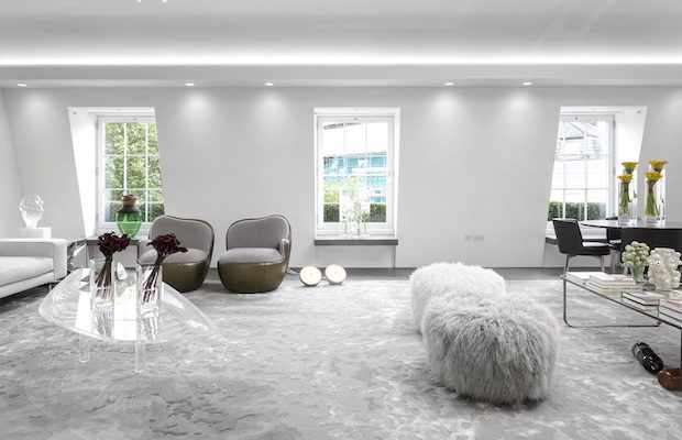
 Photography by FERNANDO GUERRA
Feature
A New Light in Old London
THE APARTMENT WAS RIFE WITH potential—three stories atop a nineteenth-century building overlooking the private gardens of Chesham Place in London’s Belgravia. It had a serene and beautiful location and a lovely pastoral view through the treetops. The space was large and had good bones, though the three floors were chopped up into many rooms. All in all, it was perfectly poised to become a splendid, even dazzling, place to live. But then again, it was in London, where on any given day there might be rain, fog, clouds, and maybe—if you’re lucky— some sun. “You know how the weather is in London,” says the architect Fernanda Marques. “There is not always a lot of light.”
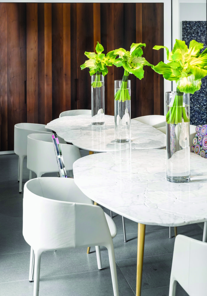
The dining room features Basoli tables by Estudio Campana, surrounded by Achille chairs from MDF Italia and Sushi chairs from Estudio Campana.
You wouldn’t realize that now. To create a bright, light, and even sunny apartment, Marques cut through the roof to install strategically located skylights that are aimed at capturing every dancing ray of sun and even an occasional elusive moonbeam. She took out interior walls and replaced them with glass partitions to further let the light flow through. She developed a pale, glimmering palette of almost evanescent grays and greens, starting with matte limestone floors that “are like the canvas you prepare for paint,” she says.
Her clients, a family of four and recent arrivals in London, had found the apartment with its intimate views of the square below and looked to Marques to design it. In turn, her challenge was to create a bright and sophisticated but completely livable dwelling place that would accommodate the family’s art and help build their growing and already formidable design collection—but with the understanding that the latter was design for living, not design for looking: a showcase, yes, but a showroom, no. “It needed to be sharp, but not too sharp,” Marques says.
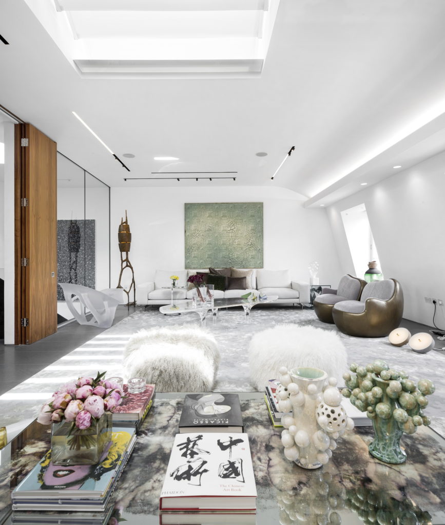
A long view of the living room shows Kate Malone’s ceramics atop a Rain table by Andere Monjo, with Joris Laarman’s Bone chaise against a glass wall at the left that was one of Brazilian architect Fernanda Marques’s design interventions. On the far wall hangs Adriana Varejão’s Baroque Song, 1999.
It was the first time the São Paulo–based Marques had worked in London; she is an architect but also an interior designer with three lines of furniture to her credit and projects in New York and Miami as well as in Brazil. With gusto, she visited the city’s design galleries, along with several others in Western Europe. She explored their offerings and then ventured even further to prowl through the galleries’ warehouses to seek out truly choice pieces to enhance her clients’ growing design collection. She was tireless in her search. Among the galleries she visited were Carpenters Workshop, David Gill, FUMI, Libby Sellers, Adrian Sassoon, Mint, and Maria Wettergren.
The result: an apartment full of contemporary treasures. The coffee table was designed by Zaha Hadid. “I fell in love with its light sensation, the watery shadow it produces aligned with high technology,” Marques says. There’s an “amazing” Bone chaise by Joris Laarman and a Chewing Gum side table and two chairs from Mattia Bonetti. The dining tables come from the Campana Brothers. A Maarten Baas clay table is bedside in the master suite, while the children’s bedroom features Anton Alvarez stools. Even the accessories were carefully chosen—including Fabio Novembre’s witty Murano glass Happy Pills (for Venini) that spill across the living room, Kate Malone ceramics, and Zaha Hadid table sculptures.
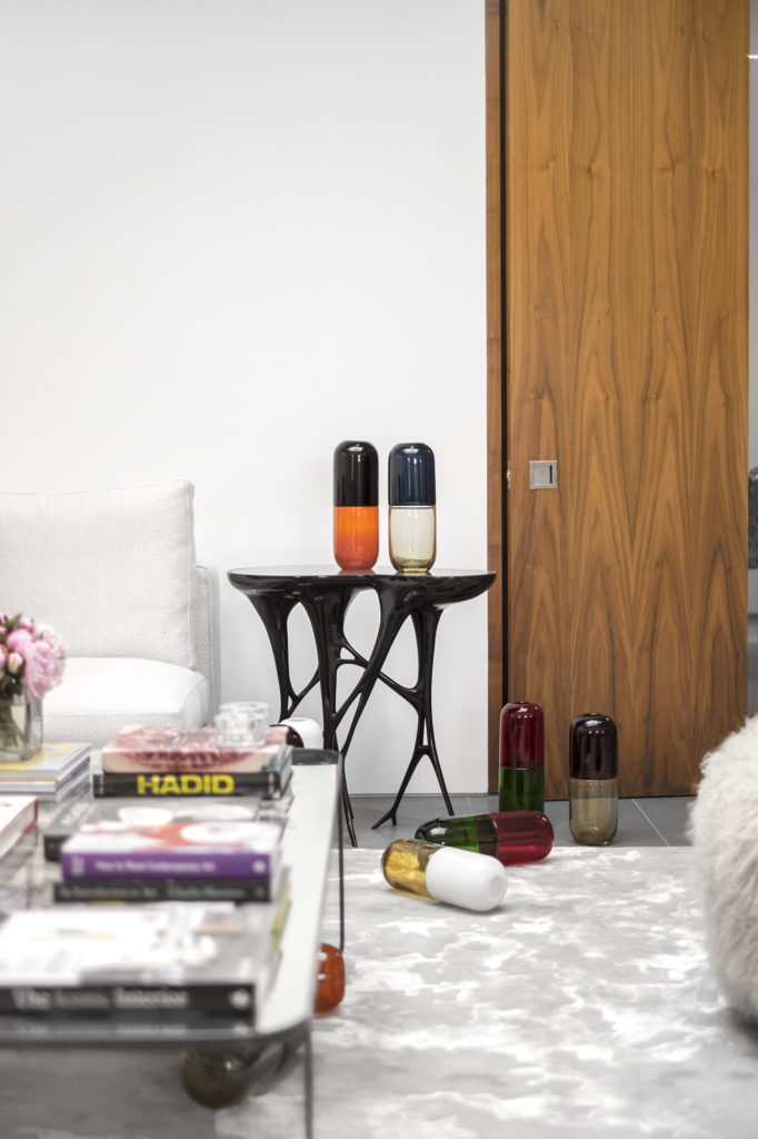
A Chewing Gum table by Mattia Bonetti provides a staging area for Fabio Novembre’s Murano glass Happy Pills.
The family had a distinguished art collection in their home in Brazil already, but for this apartment they took a new tack, pairing Brazilian artists such as Adriana Varejão with modern masters such as Alexander Calder and Jean Dubuffet. All seem to fit in seamlessly in this contemporary space hidden behind the building’s landmarked historic facade. “We had to make a lot of modifications,” Marques says, speaking of the process of transforming the space to accommodate the family and showcase both furniture and art. “When I first came into the apartment I immediately knew I wanted to make it brighter. But I always start with the layout. I make an equation in my head and then follow it.”
The formal entrance is on the middle level; a dramatic curving staircase there leads up to the top floor, where the living and entertaining spaces of the house are located. The master suite is on the bottom floor, and the children’s bedroom and a guest suite are on the middle level.
The stair looks like steel but is actually constructed of gypsum that is faux-painted, “like trompe l’oeil,” Marques says. A skylight positioned directly above the staircase adds to the drama, luring visitors up to the next floor. “I wanted to make it an invitation to the guests,” Marques says.
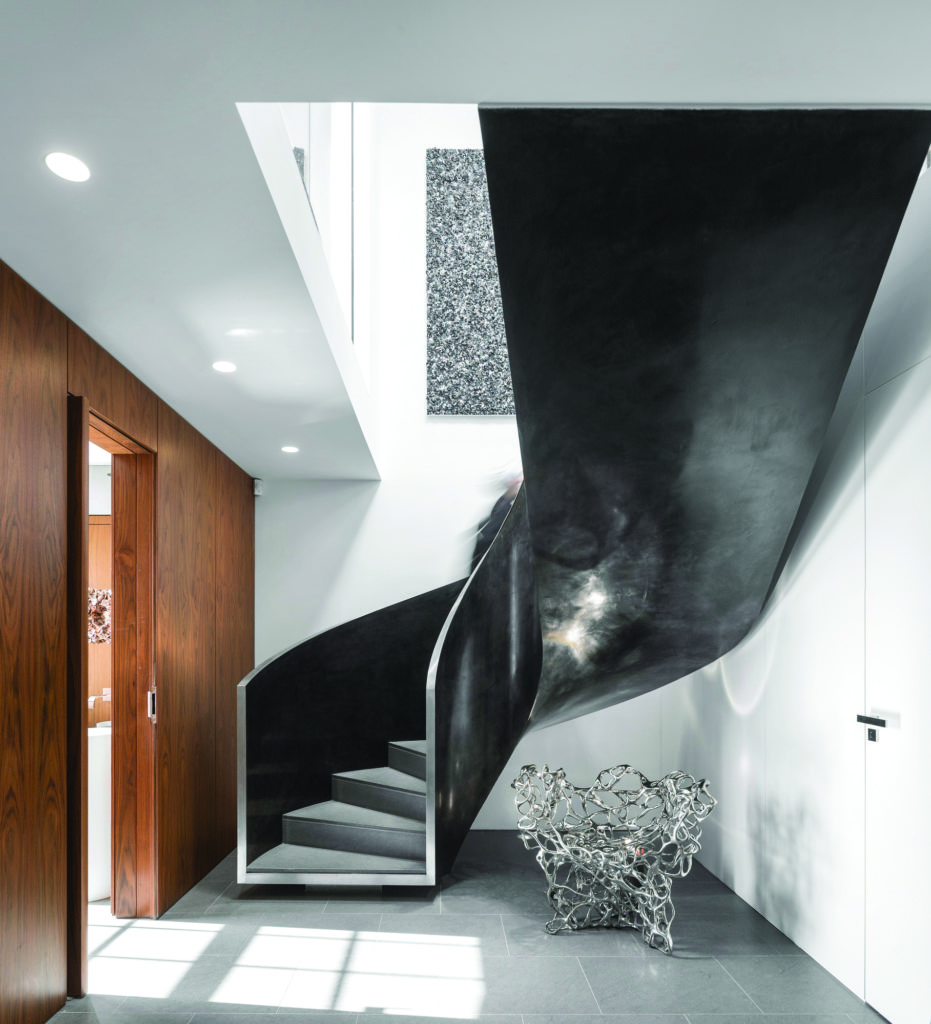
The main entrance to the three-story apartment is marked by a grand sweeping stair designed by the architect. A Growth chair in bronze by Mathias Bengtsson sits under the staircase.
The renovation was not just floor-to-floor but also floor-to-ceiling, and it required a certain amount of architectural derring-do. Marques loves big open modern spaces, especially in the more social areas used for gathering and entertaining, but London’s strict fire regulations call for the separation of rooms. Her solution: glass panels that are officially walls but not visual barriers. “It allows for the integration of the spaces,” she says.
The middle floor posed a problem that was almost the opposite—concealing the boys’ bedroom and guest suite from the apartment’s formal entrance. To resolve this, Marques concealed the rooms behind sliding wooden panels. “All the architectural difficulties turned out to become super decisions—for the best,” she says.
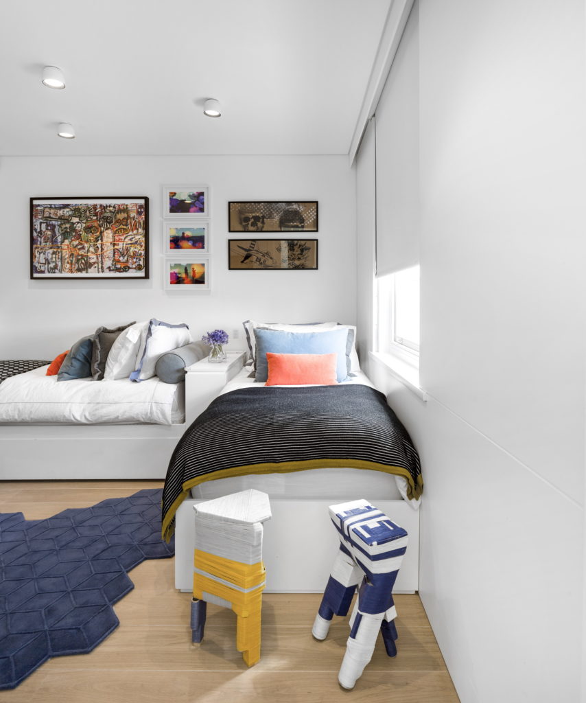
In the boys’ bedroom, two thread-wrapped Anton Alvarez stools and a rug by Christian Fischbacher add color.
After that, the decisions were all about design. Marques chose the limestone for the living area, opting to contrast a floor that is “kind of cold” with luxurious fibers and textures—rugs of silk, velvet upholstery, and lambskin ottomans among them. Still other pieces are shiny and even mysterious, such as Fredrikson Stallard’s Silver Crush table of crumpled aluminum encased in a glass box and a Rain table by Andere Monjo, made of steel, distressed mirror glass, and watercolors. There are splashes of color here and there—the client loves blue—but Marques opted primarily for the more muted palette that best serves the design and the art. Her goal (and achievement): “I sought a high level of design—furniture and art pieces mixed with very comfortable sofas, armchairs, rugs, and cushions full of texture. I didn’t want it to look like a gallery,” she says. “It had to be a place to be lived in, and well lived.”
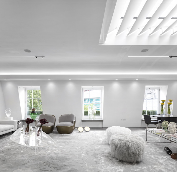
A focal point in the skylighted living room is Zaha Hadid’s Liquid Glacial coffee table. Other important works of design include two Ball armchairs by Mattia Bonetti. The aptly named Ephemera rug is from Tai Ping. The Mongolian lambskin–covered ottomans are Ski Valley Mongolian stools by Pfeifer Studio.


