 Image courtesy of the author
Feature
Almost Lost, Then Found
ALL IMAGES COURTESY OF THE AUTHOR
THIS IS, IN A WAY, A DETECTIVE STORY, though not a “whodunit.” Several years ago, I started looking for a Dr. Fritz Block, aka Dr. Fred Block. My search was prompted by a 1945 letter from architect R. M. Schindler to Elizabeth Bauer Mock, then director of Architecture and Design at the Museum of Modern Art. It piqued my interest. Here was Schindler—who openly criticized most architectural photography and even ruthlessly cropped finished prints—recommending a photographer’s work. In his letter to Mock, he suggests that she take a look at “Dr. Block’s collection of colored slides” to get a better picture of how modern architecture was developing in the West.
Although I’ve been investigating Southern California domestic architecture and photography for quite a while, I’d never encountered Block’s name before. As a longtime contributor to Aperture, I’ve published a monograph about Edward Weston and perused underknown California images courtesy of a fellowship at the Center for Creative Photography in Tucson. I’ve spent a lot of time with the papers of Esther McCoy (author of the groundbreaking book Five California Architects), postwar magazines, and photo archives; I’ve also been quick to point out that Julius Shulman, with his showboat attitude and hyper-staged pictures, was not the only person who had a camera in mid-century California. Over the years, I’ve discovered plenty of great non-Shulman photographs. Schindler’s letter assured me that Block’s were worth looking for.
The historical past, commonly recalled in shades of gray, shines brightly here beneath vivid azure skies
A German-Jewish architect born in 1889, Block had been a partner in the Hamburgbased practice Block and Hochfeld between 1921 and 1938, when he fled the Nazi regime and moved to the United States. Settling in Los Angeles (“Weimar on the Pacific”), he became known as Fred and established “Dr. Block Color Productions,” a visual aid agency that made and distributed thousands of “educational and documentary color slide series.”
I was visiting the Architecture and Design Collection at the University of California, Santa Barbara, researching the Schindler papers, when I first became aware of their “partially processed” archive of Block material. Among the items in four storage boxes were black-and-white prints of Weimar-era interiors; a photocopied book, Probleme des Bauens (Potsdam, 1928), edited by Block and featuring contributions by Walter Gropius and Richard Neutra; a typed lecture titled “Modern Architecture” and marked “Property of the United States Government”; and two sheets of cardboard-mounted transparencies of architectural subjects.
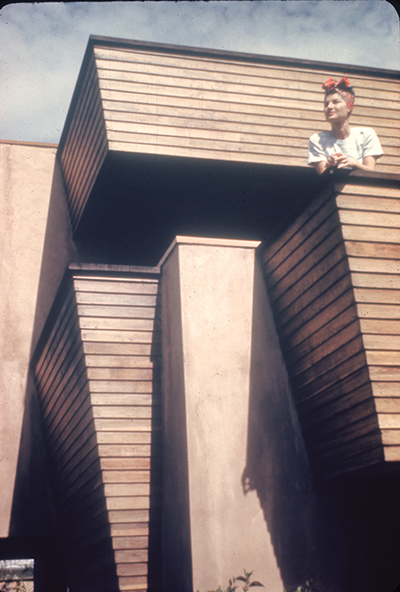
The architectural images were oddly startling: carefully observed studies of Schindler’s urbane Buck House (1934) and his final project, the Skolnik House (1950–1952), with its jagged roofline and sinuous metal bannister, are both rendered in vivid Kodachrome color. The historical past, commonly recalled in shades of gray, shines brightly here beneath vivid azure skies. Serious architectural views, the enduring fiefdom of large-format photography, are intimately portrayed in 35mm. Block’s images are precise, informed by architectural understanding and functionalist aesthetics. The pictured houses—surrounded by an undeveloped landscape of spindly young trees, exposed hillsides, and burgeoning vines—were still recent constructions bristling with new ideas.
Wanting to know more, I decided to turn my attention back to MoMA and check out the Elizabeth Bauer Mock connection. I was already familiar with Mock through various publications, including the catalogue for her 1944 MoMA exhibition, Built in USA. Her interest in West Coast modernism was genuine and actually anticipated Schindler’s savvy advice. A 1932 Vassar graduate and charter fellow at Frank Lloyd Wright’s Taliesin, she’d started out part-time in the museum’s Architecture and Industrial Design Department in 1937, and was named director just five years later. In the Block collection at Santa Barbara, there’s a 1943 letter from her, outlining an idea for a slide series that would document the Bay Area as well as Los Angeles. “If the list is to be representative of modern California architecture,” she writes, “it should include examples of [John] Funk, [William] Wurster (especially the very colorful Valencia Gardens and the Stern Dormitory, and [a] couple of his simple houses . . .),” and she continues with an impressive list, encompassing indigenous architecture in addition to Greene and Greene, Bernard Maybeck, Raphael Soriano, and Gardner Dailey. Her proposal is thorough, attentive to the state of American design in wartime, and conscious of historical and regional influences. She also admits that there is no funding available but generously offers to promote the series, distribute it to progressive schools, and obtain a set for the museum’s library. While searching through MoMA’s archived bulletins, I came across a report in the January 1944 edition announcing “Pictures at Work,” the museum library’s initiative to expand its circulating collection of contemporary slides and photographs; Block’s “valuable collection of architectural Kodachromes” is gratefully acknowledged alongside similar gifts from Philip Johnson and Serge Chermayeff.
Although Mock left MoMA in 1946, the museum’s library continued to make Block’s slides available to borrowers well into the 1950s. In addition to boxed sets chronicling everyday life and documenting museum collections and modern design, Block and art historian Alois Schardt, a fellow émigré and the Nazi-banished deputy director of the National Gallery in Berlin, created a series of packaged slide lectures focusing on natural forms and cultural objects intended “to train the eye.” In a 1946 letter, Bernard Karpel, longtime chief librarian at MoMA, enthusiastically promoted Block and Schardt’s project to other institutions: “Dr. Fred Block has devoted the past ten years to the perfection of an intensive and poetic technique. Its objective is a colorful inventory of the most significant artifacts of primitive and modern times.
Its method is the fullest realization of essential forms and textures. Committed to the medium of the educational color slides his vision recalls the perennial wonder, with which we face the phenomena of man and nature made manifest as artist.”
Seventy years later when I contacted the library at MoMA, I was informed that they had “very little information about Fritz (Fred) Block” and that his slides had been thrown away. I’d already managed to find the little information they could offer, namely that, in 1950, Block—along with Ansel Adams, Paul Strand, Paul Outerbridge, and Louise Dahl-Wolfe—had been included in the museum’s first exhibition dedicated to color photography, curated by Edward Steichen. Although Kodachrome film had been around since 1935, color photography was still strongly identified with brash advertisements and kitschy family albums. As Robert Frank memorably declared, “Black and white are the colors of photography”; at MoMA, it wasn’t until William Eggleston’s 1976 exhibition that the line was decisively crossed and color photography was acknowledged as art.
Meanwhile, when I tried to contact the woman who had donated the Block papers to UCSB in 1986, my emails bounced back. The most recent article I could find about Block, who died in 1955, was a two-part portfolio titled “Around the World with Leica” by art historian Roland Jaeger that appeared in the magazine Leica Fotografie International in 2005. Block had taken up the revolutionary Leica, an unobtrusive “miniature” camera that transformed photography with its speed and clarity, in 1928, and traveled the world with his wife, Anna Sophie, collaborating on vibrant picture stories about modern life and contributing his photographs, accompanied by her texts, to the popular German illustrated publications that were the prototypes of America’s Life magazine.
Block’s 35mm black-and-white images of the 1930s—capturing the bravura geometry of the Pont Transbordeur (Le Corbusier’s choice for the century’s most beautiful structure) or a dizzying downward view from New York’s Chrysler Building—display what critic Anthony Lane has dubbed the “old, bewildering Leica trick: the illusion, fostered by a mere machine, that the world out there is asking to be looked at— to be caught and consumed while it is fresh, like a trout.”
I searched for more of Block’s “Color Productions” in all the usual places—the Library of Congress, art schools and universities, archives, architecture books, the last remaining audio-visual houses, photo fairs, eBay, and vintage periodicals— and was able to gather scraps of information and stray images. At the National Archives, there was no trace of his “Modern Architecture” lecture stamped as government property in the records of the United States Information Agency (essentially the postwar cultural arm of the Marshall Plan).
When I looked through mid-century publications, however, advertisements and endorsements for Block’s slide business in Hollywood began to pop up in educational journals and audiovisual directories. His vast inventory included slide sets and study guides on a wide range of subjects—Zoo Animals, Modern Industrial Design, Los Angeles Harbor, Art of the South Pacific, Cloud Formations, the Potter’s Workshop (of Bauhaus-trained ceramist Marguerite Wildenhain), Kaiser Steel, and of course, Architecture.
Block…had been included in the museum’s first exhibition dedicated to color photography, curated by Edward Steichen
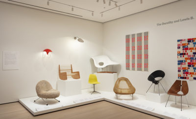
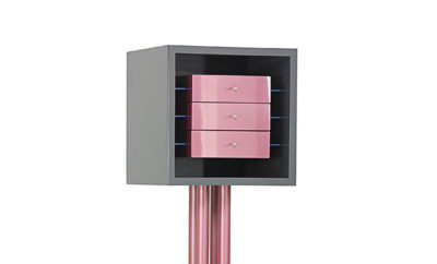
The Modern Industrial Design series, comprising a hundred slides, showcases objects selected from MoMA’s annual design exhibitions, starting with Useful Objects (1938) and continuing through to the first Good Design show (1950). It’s a rather all-star cast: there’s a curvaceous Russel Wright armchair upholstered in pony skin, a Beatrice Wood vase with a pocked volcanic glaze, an unexpected group of Tupperware tumblers and bowls, and an Eames coffee table, tipped over onto the carpet, displaying its shock mounts and spidery metal legs. These little vignettes of well-designed objects casting unwieldy shadows and awash in sullen colors are as alluring and melodramatic as a Douglas Sirk movie.
Each of Block’s series on modern architecture was accompanied by well-informed notes on contemporary design, technical advances, the influences of time and place, and what he called the “three dimensional achievement wrought by poet engineers.” In the lecture written to accompany the New Concept of Space—Modern Architecture II slide show, he commented that “industrial design, at its best moments, represents a mellow interlude between wars, conflicts in the creation of form which constitute the essential nature of architecture.”
Block’s appreciation for Southern California and its architecture—he wrote about the region’s openness to experimental ideas, the mild climate that accommodated flat roofs and indoor-outdoor living, and the options for economic building solutions—is also evident in his thoughtfully considered photographs. He admired Albert Frey and John Porter Clark’s inexpensive aluminum-clad desert houses, the ingenuity of Wright’s textile blocks, and Harwell Hamilton Harris’s Cecil J. Birtcher house, “modern American architecture at its best, all American and all modern.” His photographs closely examine the organization of space, structure, and site, and aim to allow us “to study for ourselves two arts [photography and architecture] inspired by a single vision.”
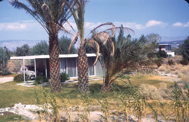
When photographing Schindler’s complex houses with their clerestory windows, dynamic interiors, and sculptural hearths, he nimbly balanced incongruent light sources and receding spaces. His early 1940s images of Palm Springs capture its intoxicating combination of architectural daring set in a nearly uninhabited landscape: a bulbous sedan seeks shade in an austere carport constructed from corrugated metal; an outdoor room of Frey’s minimalist cast-concrete furniture presages the sculpture of Donald Judd; and Neutra’s Grace Lewis Miller house shines like a vein of silver sandwiched between a cluster of cholla cactus and blooming ocotillo, with the San Jacinto Mountains in the distance.
After Block’s death in 1955, his widow donated a large collection of slides to USC and set up a small bursary for an architecture student in her husband’s name. Over the next twenty-five years she continued to operate their business, marketing and distributing an inventory of five thousand slides.
Block’s early 1940s images of Palm Springs capture its intoxicating combination of architectural daring set in a nearly uninhabited landscape
Several of the large audiovisual houses specializing in educational slides also distributed the slide sets to schools and museums; often, however, the original series were dismantled, integrated anonymously into other slide collections, repackaged under different titles, or loaned out piecemeal. As I looked for Block’s slides, I came across lonely listings for a single slide in a library catalogue or an orphaned study guide for sale at a photo fair.
The largest collection was that at USC, but like the now extinct Kodachrome film, slide libraries were fast becoming an endangered species. In 2014 a library supervisor at USC wrote to tell me that the slide library would likely be terminated and they wanted to know about any holdings worth preserving. He asked if I might write a few sentences about the Block collection and its significance in terms of Southern California architecture. I did, quickly and emphatically, distilling a lot of visual information, hoping that Block’s carefully made images of those places and of that particular time would not be lost.
Happily, earlier this year USC’s art and architecture library posted just over a thousand mostly little-known images of West Coast modern architecture online, sparking an internet buzz of mid-century mania. Billed together under the single drab cataloging term “Architectural Teaching Slide Collection,” they included two recently digitized collections—Block’s and one assembled by the well-known mid-century Los Angeles architect Pierre Koenig—and generated a dizzying wave of Twitter-speed enthusiasm, cursory critique, and random misinformation. The images were hailed by the webosphere as “Retro-Instagram” and architectural “eye candy” and slighted as “non-professional” and “spontaneous snapshots” by two credentialed architects who were “no Julius Shulmans.”
Reading through these hasty online reactions, I was reminded of notes that Anna Sophie Block had made for a photography conference sometime in the 1970s. Introducing herself as her late husband’s former assistant, she said that she was now a promoter of his idea of teaching people to open their eyes, spend time, and look. “To music one has to listen,” she reasoned. “Photos have to be seen—look.”


