Design
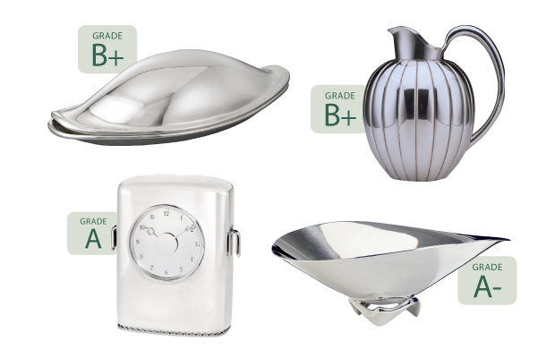
Grading System: At Georg Jensen, the Glitter is Silver
WITH A FOCUS ON THE MID-CENTURY, TROY SEIDMAN LOOKS AT IMPORTANT AND ELEGANT WORKS OF THE LEGENDARY DANISH SILVERSMITH
In September the London Financial Times included a tidy and uplifting article on renewed interest in collecting silver—both from contemporary creators and established silversmiths, active or dead. The author, Trish Lorenz, noted that historically silver was an important status symbol in the home but had fallen out of fashion during the second half of the twentieth century. Its recent (but subtle) momentum in the marketplace can be attributed to a number of factors, including a desire for provenance, or for objects that were created from exceptional materials, demonstrate craftsmanship or innovative manufacturing processes, or have the potential to appreciate in value.
This edition of Grading System will look at Georg Jensen, the legendary Danish silver company. I’ll focus on the period from 1935 to 1973, a time frame that is not only relevant to the development of modernism, but is bracketed by two important milestones in Georg Jensen’s history. In 1935 Georg Jensen, the patriarch and company founder, died, and management of the firm was taken over by his son Jørgen (1895–1966). While not to suggest that the first several decades of business were in any way stodgy or insignificant, when Jørgen took the helm he ushered in a new era of innovation not only in aesthetics but also in manufacturing, business practices, and products offered. In 1973 the company merged with Royal Copenhagen.
Jensen the elder considered himself a “silversmith sculptor.” His early pieces, whether he designed them himself or in collaboration with others, repeatedly demonstrate an ongoing tension between ornament and simplicity; he also encouraged the assimilation of trends from various (pre)modernist aesthetic movements and their complementary interest in functionalism. Many of the early pieces have a significant physical component that is completely smooth and unadorned but is supported on a base or shaft with garlands of fruits or tendrils. In the early decades the firm offered a broad inventory that went beyond tabletop accoutrements, including timepieces, women’s accessories, jewelry, and scientific instruments.
Numerous Scandinavian designers have designed for the firm, which was established in 1904, including Kay Bojesen, Nanna Ditzel, Piet Hein, Jens Quistgaard, Arne Jacobsen, and Verner Panton. Here I discuss two who may be lesser known but were among the most accomplished: Sigvard Bernadotte (1907–2002) and Henning Koppel (1917–1982).
Bernadotte, the son of the king of Sweden, joined the Jensen firm in 1935. He is considered the “functionalist,” as his designs pushed ornament away, streamlined forms, and introduced more geometric elements. One of the first (and foremost) Scandinavian industrial designers, he is best known for his eponymous flatware designs for Jensen, including the Bernadotte cutlery service, which is often and universally imitated. Its confident aesthetic eludes being pinned
to any design genre—it is simultaneously neoclassical and minimal. This paradox is often found in his work at Georg Jensen, with his forms inspired by architecture, machines, and the future, rather than nature.
Henning Koppel was a sculptor first, not a silversmith or product designer. His initial contributions at Georg Jensen were rejected outright and those that did go into production were not commercially successful. Despite his early missteps, Koppel went on to design some of the company’s most iconic and innovative mid-century creations. He not only designed hollowware and flatware but also jewelry and lighting. Koppel is emblematic of many fine mid-century designers about whom we need more scholarship in order to fully appreciate their work. I am optimistic that as the vintage Georg Jensen/Koppel market expands more pieces will come to market, deepening our understanding of his vision and creative output.

“Melon” Pitcher 856A
Designed by Sigvard Bernadotte 1938
Amidst all the baubles, vessels, and accessories Georg Jensen released during the twentieth century, its designers repeatedly excelled at one form—the pitcher. Allan Scharff, Johan Rohde, and Harald Nielsen in different eras all created memorable examples. While less familiar than Koppel’s 1952 “Pregnant Duck” pitcher, this 1938 design by Bernadotte is a notable precursor. At first glance it appears relatively simple, but formidable technical precision is required to create the three elements (handle, spout, and body) independently and then solder them together. Koppel’s contributions may overshadow Bernadotte’s, and perhaps his designs have aged better and remain more poetic today; however, consider that Bernadotte designed this piece in prewar Europe, not during the creatively explosive era of the early 1950s. While its body suggests an architectural formality, the other elements are playful and confident. Why do I hesitate to give top marks to this piece? At less than six inches tall, the pitcher is not very practical for the twenty-first century; it was intended to hold cream and complemented a bowl designated for strawberries, too dainty and specific to be a design superstar.