 © Charles Moore foundation
Feature
Tiny Triumph
The Charles Moore Foundation transforms a nine-foot cube into a sanctuary for visiting architects, artists, designers, and scholars
We lost architect Charles Moore on the morning his Chevrolet Suburban was being packed for a road trip from Austin, Texas, to Sea Ranch, California, where he was planning to build a studio among a grove of redwoods, a beautiful spot he loved, and where all of his collaborators could come to work with him. That he died so suddenly on the very day of one of his transcontinental relocations was at once horrendously sad but remarkable in its own way, as though all his previous relocations, choreographed in rough ten-year intervals (from Monterey to Princeton to Berkeley to New Haven to Los Angeles and to Austin) would conclude on that December morning in 1993. Moore left behind an enormous legacy: legions of students, many fine books that remain in print, ideas that led a whole generation of architects in new directions, and, of course, many buildings that endure.
One of them is the Moore/Andersson Compound in Austin, a “loose confederation” of two houses and two studios that he designed and shared with his architectural partner at the time, Arthur Andersson, who still practices in Austin. When many of Moore’s colleagues and family gathered at the Moore/Andersson Compound after his death to discuss how a foundation might be established to honor such an extraordinary person (who eschewed any attempts at aggrandizement), the overarching conviction was that any effort to preserve the compound must be first and foremost an effort that would keep the place “alive”—about today and tomorrow, open to ideas and points of view. It should never be a place where all the oxygen is removed for the sake of historic preservation, and most of all, never become a shrine where fealty is expected.
With all in agreement that “vitality” and “relevance” would be key principles, the Charles Moore Foundation became a reality in 1997. Its board and, as its director, I accepted the responsibility of caring for the entire property, library, and collections. However, this all came with a mortgage debt of nearly $400,000 and imminent monthly payments (drawn from our woefully meager cash reserve) that practically had the sheriff waiting at the end of the driveway, ready to attach unpleasant papers to our door. Happily, in five years we managed to retire the debt, thanks to philanthropists and well-attended fundraisers. Today the foundation continues to care for the architecture and landscape, and, in addition to publishing the Placenotes travel guides and holding conferences and lectures, it also provides residencies for architects, designers, scholars, artists, and curators visiting Austin.
Sited on a sloping wooded acre, the compound calls to mind sheltering Mission courtyards of the Hispanic past as well as modest constructions of middle European settlers of the Texas Hill country, all tied together within a board-and-batten husk, under a meandering galvanized roof. The Moore House is awash with a rococo riot of color and light, pattern, ornament, folk art, and toys. The Andersson House is all white, sharper and crisper, with one major living space dominated by a Roman-scaled rendition of a Francesco Borromini window surround. One studio was the architecture office, the other a drafting room and model shop.
Off in one corner of the compound there was also a tiny room with its own entrance that Andersson designed as a kind of studiolo for painting (he is a master watercolorist). Roughly nine by nine by nine feet, it came to be known as the “Cube Room.” The foundation had little use for such a tiny studio, and even though we allowed guests to occupy the room (it had narrow built-in day beds) even a one-night stay was spatially and psychologically tight. After the architect Coleman Coker once gamely occupied it for a three-month stretch, we began to wonder how it might be made more comfortable, say for a modern-day architectural monk who fondly recalled the Le Corbusian sections of the Convent de La Tourette. Could the Cube Room find new life with a little bit of architectural attention?
For two years, Adam Word Gates, a recent graduate of the University of Texas School of Architecture, and I carefully considered the problem, as any changes made to the physical premises are undertaken with great care so as not to upstage or spoil the intentions of the original. We often joked about the former mayor of New York City who, while inhabiting a many-floored Upper East Side mansion, felt members of his electorate could live in microunits of less than four hundred square feet. Since our project would inflate the existing 81-square-foot Cube Room (and its own little private bath) into a whopping 220 square feet (including a shower and loo and sink), we gave our ambitious project the subtitle “Mike Bloomberg, eat your heart out.” We understood our challenge was how to make an impossibly small space seem big, even claim something approaching grandeur.
We favor the opinion that strong design arises from limitations, real or imagined. Our limitation was not to expand the building’s footprint. Even adding a little bay—what Moore would have called a “saddlebag”—was not possible, as Moore and Andersson had built the compound right up to the site’s deed restriction setback, which the neighborhood is still in favor of obeying. That left us with the thought of building up, but that strategy was limited by another rule we set for ourselves—not to rise above the existing ridge beam. (We also faced the limitation of a tiny budget, which required us to build all of it with our own hands.) The only answer was to perform some “architectural surgery” and reclaim a corner of oddly shaped attic space that was formerly accessible only by a ladder and trapdoor.
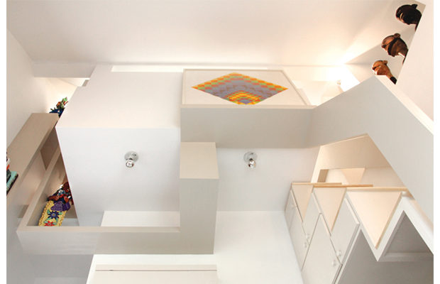
Since the only place in the attic where one could stand up properly ran under the ridge beam, we knew this narrow slice of space would need to act as the “corridor.” But that didn’t leave any room for a bed. Luckily, an existing gable window on the far side of the compound provided the answer. By duplicating its dimensions and proportions almost exactly, we were able to insert a new window in the attic and open up a nook just big enough for a bed. The window (as long as the room is wide), performs a kind of sleight-of-hand, deflecting attention away from just how minuscule the room is, even extending the space, at least in our imagination, into the canopy of the post oak just outside, whose leaves filter the light that spills back inside. Little triangular panes swing open to admit fresh air and birdsong.
That left the significant problem of how to get up to the sleeping loft. A ladder was out of the question. So was a fire pole. The answer came in the form of a kaidan-dansu, a type of Japanese tansu—cabinets-cum-staircase. Still with the space as tight as an Antwerp belfry, we had to divide each of the treads into two, one apiece for the right and left foot, as Carlo Scarpa had done in many of his buildings and gardens. Instead of safeguarding precious family heirlooms, this tansu hides the microwave, coffee maker, refrigerator, corkscrew, and garbage disposal. A Murphy table (preserved from the earlier design) flips open for dining or study, resting on a free-standing pedestal that can be tucked away when not in use. Inside are coffee cups and drinking glasses. A coat closet, which conceals the ventilation chase, lets guests hang up jackets in elevation, not side by side.
When guests ascend the stairs, they discover the tiny, light-filled chamber, hidden away, we like to think, from the cares of the world. It’s all layered three dimensionally, locked together in structural cooperation. The bed’s headboard supports a desk, while the desk provides lateral bracing for the headboard. (The bed’s footboard conceals a television.) The desk also doubles as the loft’s railing. Guests can sit and work and let their bare feet dangle over the edge. Then the desk splits into two “ribbons” of equal width. Each folds and plunges into the space below, finding its way around light fixtures and windows while also creating bookshelves. Once the ribbons reach the staircase on the opposite side of the room, they each fold again to become the railings, so that like a Möbius strip, one is led back to where it all began. The overall feeling is of a ribbon on the inside of a gift-wrapped box, not the outside.
What the gift box contains is folk art contributed from the collection of Margie Shackelford and her late husband, Alex Caragonne, who together spent decades amassing one of the most superb collections this side of the Rio Grande. The brightly painted ceramics, wild in form—Conquistadors loading slaves into the galley of a ship with a dragon’s head for a prow, for instance—contrast with my own collection of equally vibrant, but precise geometric compositions of the Bauhaus master Herbert Bayer. These “allies of inhabitation” keep company with a whole new generation of foundation residents who come here to work, study, and enjoy the place Charles Moore initiated.
Kevin Keim is the director of the Charles Moore Foundation. He is a designer and author and the founder of the publication Placenotes.


