 Photography by Stephan Julliard
Feature
The Best Lot
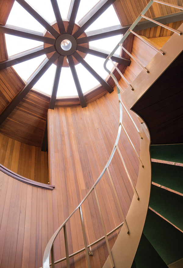
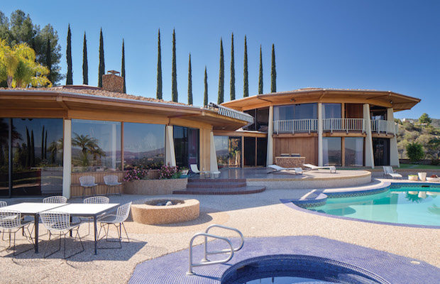
BACK IN 2010, Peter and Shannon Loughrey, the founders of Los Angeles Modern Auctions, were comfortably settled in their “modern ranch style house” in Sherman Oaks, with no intention of or interest in moving. That was, however, until Peter stumbled across photographs of an unorthodox post-and-beam glass house in Encino. His interest was piqued. Los Angeles is a city studded with celebrated modernist homes distinguished by their streamlined geometry and angular lines, but this house, with its two connected “circular” twelve-sided structures, and once characterized as “mid-century modern meets Las Vegas glam,” prompted him to make an appointment to see it. “I was like, ‘this is either the ugliest house I’ve seen or the most beautiful,’” Peter recalls.
To his delight, he found that the bones of the building and its unique circular massing were true to the photographs, in spite of the Laura Ashley-esque prints masking the interior and the brightly painted retro kitchen. “It had a really sophisticated forward-thinking structure, but then it was decorated in wild ’80s floral patterns. It didn’t make sense,” Peter recalls. “When I got there, I realized you just have to take away this stuff and get it back to the original structure of ’72.”
He was immediately convinced, but Shannon was hesitant—until he took her to see the house. She walked around the property and was awestruck by the sweeping 270-degree view of the city, mountains, and canyons. Not quite a month later they closed on the deal. “Later, I finally said to him, ‘you know, I get it, I totally get it,’” says Shannon. “He got it in thirty seconds. I got it six months later.”
The house had been designed for the owner of a string of nightclubs and liquor stores on the West Coast, Joby Lewis, and his wife, Helen, by the Los Angeles–based architecture firm Benton/Park/Candreva, which was founded in 1956. All three partners had graduated from the prestigious USC School of Architecture, learning from such modernists as A. Quincy Jones, who eventually served as dean there. Earlier in his career, Donald Park worked at the firm A. Quincy Jones, AIA, and Frederick E. Emmons, AIA, Architects, before establishing his own practice with Wallace Benton, who was also employed there. “These were the guys who were being taught by the masters and also the guys who needed to push the envelope and go out on their own and create something different from what the masters were building,” explains Peter.
The two structures that comprise the roughly 5,400-square-foot house are connected by a glass walkway. One wing holds the dining room, kitchen, living room, and sunken conversation pit; the other, four bedrooms, two bathrooms, and a library.
Though larger than the Loughreys’ former house, the new one, with its expansive picture windows and built-in features, could accommodate only so much art and furniture, which meant they had to do some editing of their personal collection. Out went much of the furniture from the living room in the Sherman Oaks home, including a T. H. Robsjohn-Gibbings coffee table, a Charles and Ray Eames 420-C storage unit that they had used as a room divider, and initially a Gio Ponti couch, which they later were able to incorporate when one of the bedrooms was converted into an office. With limited wall space suitable for art, nearly half of their extensive collection is in storage.
The Loughreys stripped away the overly busy floral wallpaper, curtains, and swags that impeded the views of the landscape. Mirrors in the living section of the house, which created a dizzying “maze-like” effect, were promptly removed. “There was no moving about without being spotted somewhere! I think the owner was trying to reflect the outside view back into the house, but it just didn’t work,” explains Peter. Next, he dismantled an “over-the-top, fabulously outdated Liberace-inspired chandelier” that hung above the dining room table. He installed Verner Panton globes—purchased at the Copenhagen Modernism fair—just in time for their first Thanksgiving dinner in the house.
“The globes worked perfectly because they were designed in the same period as the house,” he says.
It was more difficult to reach consensus on the hot pink and purple kitchen. He loved it; she had her doubts. The brightly painted room was in stark contrast to the quiet warmth of the rest of the interior, with its old growth–redwood woodwork and granite stonework. But as time went by, the kitchen began to grow on Shannon, and she realized that the palette actually picked up the colors of the sunset. “The kitchen has such a spectacular view over the pool and the west and the mountains, so every now and then we have this amazing every-shade sunset with this incredibly bright hot pink, and I get it— that it’s kind of reflected in the cabinets in the kitchen. I don’t think I can replace that. I don’t think if we wanted to change the tiles, we could find that material again.”
As auctioneers and collectors, they have accumulated impressive holdings of contemporary art and mid-century furniture, and this idiosyncratic house has turned out to be an ideal setting for much of the collection— including such pieces as a Harry Bertoia sculpture, an Andy Warhol Electric Chair Suite print, an Arthur Espenet Carpenter dining table, and a Hans Wegner Papa Bear chair and ottoman. Postwar Italian pieces from Gio Ponti work as naturally in the space as American mid-century and studio furnishings by George Nakashima and Charles Eames, among others. “It is amazing that these pieces [by Ponti] which were made in the late ’50s fit so seamlessly into this house. A lot of people when they walk around think they were built by the architects,” Peter says. In the living room a Mitchell Bobrick table lamp adds a pop of color atop an Eames storage unit, right beside two elegant John Nyquist lounge chairs.
The meticulously arranged interiors are also subject to change. Impermanence is a way of life for a dealer. “There were a few pieces that worked perfectly, and we thought we would never let go,” Peter says. “We had some spectacular Rauschenberg works, and when they got sold, we had to find something else, but because we are in the business there is always something else.”
These days, the Loughreys are embarking on a more substantial and permanent change to the house—another twelve-sided addition that will be built out over the garage, encompassing a bedroom, sitting room, dining room, and kitchen, intended for when their parents visit. A few adjustments will be made to the interior to create more wall space for their art collection and room for some specific furnishings intended to become permanent fixtures—including an Alexander Clader jute tapestry from Bon Art Editions, more Verner Panton lamps, and a George Nakashima dining table.
Serendipitously, the original lead architect, Donald Park, is designing the addition, which, in fact, is a plan he proposed to the original owners in the 1970s. “I wouldn’t consider building on to the house or altering it in any way if he [Park] weren’t available. I wouldn’t even consider it,” Peter says. “This house is so special and so perfect only the original architect can touch it. It would be like having a painting by Picasso and hiring another artist to add another figure in the background. You wouldn’t even consider it.”


