Design
Modernist Gold Rush

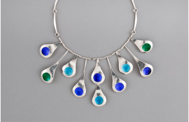
“Peacock Tail” necklace by Arline Fisch, 1962

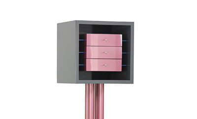
chair and ottoman designed by Hendrik Van Keppel and Taylor Green c. 1939, made c. 1959.
In 2008 the Getty Foundation initiated an ambitious plan: to bring together leading cultural institutions in Southern California, each one presenting a variation on the theme of Los Angeles’s influence on postwar art, design, and the built environment. At first the Getty only approached major museums, but the program—dubbed Pacific Standard Time—has grown to include more than sixty cultural organizations. PST, which opens October 1, is one of the most anticipated artistic and educational endeavors to come along in years.
The Los Angeles County Museum of Art—known to all as LACMA—was ahead of the Getty in their planning. Since 2007 the museum’s Department of Decorative Arts and Design had been organizing an exhibition entitled California Design, 1930–1965: “Living in a Modern Way”—a pan-Golden State examination of the designers and artisanal and industrial works that shaped twentieth-century life on the West Coast. MODERN spoke with department head Wendy Kaplan and assistant curator Bobbye Tigerman about the exhibition, one of the core elements of PST.
JH: How does “Living in a Modern Way” connect to the larger program of Pacific Standard Time: Art in L.A. 1945–1980?
WK: We were incredibly fortunate in that we were working on this exhibition for about a year before PST came along. The way PST originated was that the Getty asked the three other biggest museums in town—LACMA, the Hammer Museum, the Museum of Contemporary Art—and their own curators to submit proposals for exhibitions—anything around the topic of postwar art in the Los Angeles region. Our project covered all of California and our dates were 1930 to 1965, as opposed to 1945 to 1980, but that was fine with the Getty and we received a grant from them.
How did you use the grant?
WK: The grant enabled us to have a serious budget for research. That almost never happens. We were able to hire one full-time person and several graduate students part-time. The Getty was very clear they wanted this to be an opportunity for research.
BT: We invited nine scholars to research in their areas and then brought them to Los Angeles twice, to have group meetings and discuss the themes of the show and to help with the narrative of the show. Without the Getty, it would not have happened.
WK: Not at this scale.
BT: It also expanded the scope. We are showing 360 objects plus a full room installation in 11,000 square feet of exhibition space. It would never have been possible without outside support.
WK: We also got quite a lot of other support.
How does “Living in a Modern Way” compare to the other PST exhibitions?
BT: Our show is about design and craft, and it’s one of the larger shows in PST. There are several shows that touch on similar themes so it’s part of a group of exhibits.
WK: There are six other shows that deal with design and architecture, and another group for craft. We are in both groups. Maybe a dozen shows altogether have to do with design, architecture, and craft. The others are fine arts.
How did you decide on the dates for the show?
WK: In terms of what was being made here [Los Angeles]. There weren’t that many people making modern things until the 1930s. That decade takes up about a quarter of the show, and there’s a small section on what was being produced during the war, but the bulk of the material is postwar.
BT: There were no specific events that caused us to pick these dates. The dates represent the subtle shifts in time and attitudes.
What was the impetus for California’s postwar design?
WK: There was a critical need for housing for workers during the war and for returning soldiers who moved to the state with their families after the war. The population explosion produced a need for goods and services. Military training and the GI Bill gave many the skills to create and produce.
How would you describe the show?
BT: It’s a look back…a retrospective. A survey and analysis.
WK: A beautiful show and instructive.
What is unique about the show?
BT: One of the distinctive features of the show is the incredible range of object types. We have big pieces of furniture, jewelry, record covers, posters. Many of the pieces are from the artists directly—from Merry Renk [painter and jewelry maker], [jewelry maker] Byron Wilson’s widow, and Arline Fisch [jewelry maker].
WK: And we’ve integrated textiles and clothing.
What are some of the highlights?
WK: How to choose!? The highlights range from Jock Peters’s custom-made table for Bullock’s department store on Wilshire Boulevard, which we’re very happy to have acquired. And the Museum of Fine Arts, Boston is lending us Claire Falkenstein’s models for the gates she did for Peggy Guggenheim’s villa in Venice. They are so beautiful. And we’ve become huge fans of Greta Magnusson Grossman. Her furniture, lamps, her architecture. We’ve acquired quite a lot, given that we started with nothing of hers.
What are the re-creations, design installations within the show…there are three?
WK: Two. We omitted the Kem Weber room re-creation from the 1939 World’s Fair [officially the Golden Gate International Exposition in San Francisco] for budgetary reasons. As we know to our sorrow, everything costs more than you think. Even though we did very serious research, the total layout of the room remains a mystery.
BT: We have pictures of parts of the room but we couldn’t find an overall photograph of it.
WK: We found a rendering of the room, but it wasn’t very detailed.
BT: Even more than that, it was going to require a lot of re-creating and a lot of building out of not-original material. So we decided that of the three re-creations, we thought these issues made the Kem Weber room the least compelling and chose not to do it.
WK: We also thought our research would yield more, and one of our major purchases for the show was the original desk and chair that had been in the Kem Weber room at the ‘39 World’s Fair. This is extraordinary because the desk is unique. So now we’re slightly re-contextualizing it.
BT: We’re showing them along with a Weber “Airline” chair, not as a room but as objects.
What period re-creations are you planning?
WK: One of our most ambitious components is installing the entire living room from the Charles and Ray Eames House as part of the exhibition.
BT: The living room is being installed as it exists today, which is very close to how it was when Ray died in 1988. We decided to make this huge effort to show it because the exhibition is about how modern Californians lived. Charles and Ray Eames are probably the most modern Californians that there were. One might expect that if you imagined how they lived, it would have looked somewhat like a Herman Miller showroom—very spare and with their designs. But in fact their living room was a very complex and layered place filled with their own designs, gifts, souvenirs from their travels, and their enormous library. I think it will be enlightening to see how one of the most creative and prolific couples lived.
And the other re-creation?
WK: The second room is a re-creation of the cover of the Los Angeles Times Home Magazine of October 21, 1951, and we’re really proud of it. It was a cover story that asked “What Makes the California Look.”
BT: It’s very clear that the cover did not show someone’s actual living room—or patio. It is an abstract arrangement of objects that are all symbolic of California living at the time.
WK: One of the many things we love about the cover re-creation is that there’s no hierarchy or differentiation between the handmade and the industrially produced. It shows that living in a modern way was a combination of the two.
Were the objects on the cover familiar to readers?
WK: Many of these items, the handcrafted items, had been on display in the L.A. County Fair and many of the industrial items, like an Eames chair and a Van Keppel-Green chair, were part of a major exhibition sponsored by the State Department that toured Germany and other European countries in the early 1950s.
So they used design as propaganda during the Cold War?
WK: I read the recent literature on the subject, about “soft power.” I love that term. It’s very appropriate. The idea that you get better results when you develop a culture of consent rather than one of coercion.
BT: California was an important part of selling the good life abroad.
WK: Bobbye tracked down every single item to re-create the room. If not the exact thing, and mostly they are, then a very similar piece, such as a Maria Kipp drapery. The only thing we’re going to have to make is the Spencer Smilie screen, which we could not find.
And the white “Avanti?”
BT: The “Avanti” was designed by Raymond Loewy in a feverish couple of weeks he spent in Palm Springs. We did a lot of research into car design. Obviously Los Angeles was a center for car design and there were cars that were made here and there were body shops that customized vehicles. But it was hard to find a car that was mass-produced enough to make an impact, such as the “Avanti” did.
What about ephemera?
BT: We’re showing architecture magazines, brochures for housing, furniture catalogues. And school catalogues—since art schools were such important centers to both employ and train designers in northern and southern California.
What’s next?
WK: We are still very actively building the collection. That was one of our main goals with the show, at the same time as doing all the research and putting it together.
BT: To have the world’s leading collection—and after the show to have permanent galleries for California design. We’ve acquired about 110 objects in the last couple of years that have filled out our collection. There’s a long way to go but I think we now have a very good core collection in a wide range of media.
WK: Before, we didn’t have work by furniture designers such as Maurice Martine, Dan Johnson, or Olga Lee. We had no jewelry before. We started with ceramics and some greatest-hits architects—Neutra, Schindler, Eames. Now we have a good collection.


