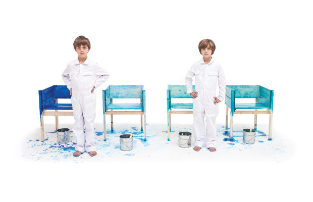
 Lucas Maassen, interested in legacy and familial ties that used to be commonplace in the trades of fine carpentry and cabinetmaking, hired his sons to paint the furniture he created. The boys sign their names on the bottom of each object they paint by hand. The desk and chair at left dates from 2013.
Design
Modern Family
At Kinder Modern, the designs may be pint-sized, but the ideas are larger than life
IT CAN’T BE A COINCIDENCE that The Story of the Three Bears, which is about a little girl and a little bear, a bowl of porridge, a chair, and a bed that is “just right,” became popular at the start of the Victorian period when there began to be public concern for the well-being of children, and artisans began to focus attention on objects that would be the right fit for childhood. Not long ago, I visited Kinder Modern, a design gallery in New York devoted to vintage and contemporary furniture for children, accessories such as chalkboards or clothes stands, and a small group of prized toys such as the Schaukelwagon by Hans Brockhage and Erwin Andra. The objects are stunning, some of them handmade or made to order, and you can see in them a trajectory of adult ideas about what fits the world of childhood and how childhood fits the world of adults. Lora Appleton and Bachman Clem, who are partners in the venture, have chosen to showcase work that has played a significant role in design history, “based on materiality as well as function,” Lora says. With an effervescent laugh, she adds, “Most of what I like to do is buy for use…whether you’re a collector or not, I don’t care, let’s use them.”
On the day of my visit, the oldest work in the showroom was a set called Peter’s chair and table, handmade from polished beechwood by the Danish designer Hans J. Wegner in 1944. Wegner made the small chair and table as a christening gift for Peter Mogensen, the son of his friend Børge Mogensen when they were living in Nazi-occupied Copenhagen and metal was in short supply. The intimacy of a gift made by one of the giants of Danish modern for another almost takes the breath away. With his lovely cutouts and rounded corners, Wegner demonstrated skills acquired during his apprenticeship as a cabinet-maker. The ingenious construction also bears the hallmark of his attention to ergonomics—in this case the needs of an energetic child who might want to wriggle or kick even while sitting. There’s plenty of unencumbered space for swinging feet forward under the table, or backward under the chair, both constructed without stretchers; openings on both sides of the chair leave room to tuck in restless fingers. All the components slide out without the need for tools, so a child can think of the different parts as individual toys (the flat chair side looks something like a rabbit, for instance) or as pieces of a puzzle, and they can all be flat-packed for storage. In presenting the gift, Wegner was expressing both the age-old desire to beautify the world for a newborn and the modern idea of educating through play and creativity. Because of their simplicity, abstract lines, and use of native materials, the table and chair fit into the surrounding adult world as naturally as the wooden parts can be pieced together. The set reflects thoughtful assumptions about Peter’s needs and growth, even preparing for the time when he is old enough to help pack the chair and table away to be saved for a sibling or cousin or his own child as an heirloom.

Hans J. Wegner’s Peter’s chair and table, 1944, exemplify the classic principles of Danish modern furniture with simple and graceful lines that draw the eye to the natural beauty of the beechwood surfaces.
Jean-Louis Avril’s 1967 desk and chair made from molded and lacquered burgundy celloderne provide a wonderful contrast to Wegner’s craftsmanship. In the 1960s Avril was part of a group of utopia-minded French architects and designers pushing for the use of non-traditional, resilient materials that would help to democratize design. Because his stepfather owned a cardboard factory that specialized in an especially strong corrugated fiberboard, Avril had access to experiment (from 1967 until his stepfather’s death in 1974) with carton cardboard, which he shaped into light and inexpensive objects—tables, chairs, lamps, and storage shelves. He developed a children’s line he called “la chaise éléphant,” which, like his other pieces, was colored in bright yellows, reds, blues, and contrasting white. For a short period Avril’s work was in the forefront of European design; it was displayed in the French Pavilion of the 1967 World’s Fair in Montreal, the 1968 Triennale in Milan, and at the Musée des Arts Décoratifs in Paris. You can see the influence of Le Corbusier’s ideas about harmonies and proportion in his child-sized table and chair with bold cutouts that allow light to flow through. The design assumes that children merit the same considerations as adults, that they will be similarly delighted by pops of color and intrigued by iconoclasm, as well as new materials and forms. Even while affordability was a goal, Avril paid careful attention to the smallest details: though seams were necessary to the construction, he placed them around the circle of the seat and down the front center of the chair’s base so they enhanced the finished design. The construction is well balanced so the pieces won’t easily topple, but the lightness of their materials makes them especially appealing to school-aged children who like to move things around to accommodate changing play—sometimes one needs floor space for a train or spaceship and sometimes one wants to set a table.

Built with bent beechwood for the frame and molded plywood for the seat, the Schaukelwagon by Hans Brockhage and Erwin Andra, 1950, rolls along, or, turn it over and it becomes a rocking chair.
Bright and reflective, futuristic and optimistic, the 1970 painted fiberglass Mod chair attributed to Finnish designer Eero Aarnio is a fantastical object. Though molded into an abstract, cartoon-like idea of a chair, there’s something unapologetically industrial about it, and it belongs squarely in the pop furniture movement, with a special nod to that era’s romance with space travel. Moon boots, made for kids (and adults) “to walk in zero gravity” came out at just about the same time (a year after Neil Armstrong’s Moon Walk). Hard and durable, low-to-the ground but heroic, the Mod chair looks like the kind of seating one would find in a flying saucer or on an intergalactic snowmobile. Like Aarnio’s famous Ball chair, its scooped-out interior also provides a feeling of insulation from noises in big space. Because the design is imbued with personality, it seems to ask a child to come along and share the designer’s creativity. The object itself teeters between toy and furniture and space equipment, between intimacy and dynamism and industry. The child who uses it is being integrated into a world of powerful forces and speed, but it’s possible to brace for safety inside the core of its happy shape and almost indestructible material.

Alexander Kanygin has constructed approximately ten Bear tables to date. This one from 2015 is scaled for children (it’s 18 ¼ inches high), but the design can be built to different specifications for grown-up use as a coffee table.
The relationship between children and modern design reflects changes in geopolitics, materiality, technology, and adult thinking about child’s play and growth, but childhood is biology, continuous and impervious to fashion. The design needs of children have changed little over the centuries, though what was designed for them did not always reflect these needs. Kids can be lonely little lambs who want to follow along and then in with clawed feet seem like mythological mixtures, part throne and part fantastic beast. Though the shape of the top of his Table for Shirley Jackson is defiantly irregular, it’s been consciously constructed so that children can sit close to one another in a cozy way, rather than in the linear fashion of conventional school tables. I asked Sullivan if the table would hold up if it had some tough customers and he said, “Yes definitely! It’s made of solid lacquered maple so it’s quite tough and kid tested!” Sullivan oversees the fabrication of all his furniture in Los Angeles; the pieces are made to order, each slightly different, based on his clients’ custom requests for size and color. When I asked about his reference to Shirley Jackson whose sinister short story “The Lottery” is a minor masterwork of American postwar fiction, his answer reflected the way he conceives of his work as satisfying to himself while fitting the small child, the growing child, and the adult it will belong to: “I name pieces after material (usually texts) that I like. The naming is purposely random, so that if there is deeper interest in a chair or whatever, an additional question might be asked, by Googling ‘Shirley Jackson,’ for instance—and a whole new area is introduced.”

The organic-shaped top of Matthew Sullivan’s Table for Shirley Jackson, 2013, appears almost to float in space.
The young Russian architect and designer Alexander Kanygin makes furniture, puzzles, and toys (sometimes blended objects) inspired by Russian tradition and landscape. For the most part he has worked with wood, using both modern and traditional technologies, but he’s also been experimenting with metal and plastic. In the past few years, he’s become known for his fanciful Beard masks and Bear masks, which reference Russian cultural iconography in a comical way. With its clean lines and meticulous craftsmanship, his work evolves from his own experiences. The Bear mask, he explains, “was created as a gift for a hunter, with the hopes that it would help him realize that it is not necessary to kill animals for sport and decoration.” Later he expanded the concept into his walnut veneer Bear table, which is made to order. Standing at just the right height for a child’s table, the Kinder Modern version could be an object to befriend or a surface to play on.

Dachsie pull toy by Brio, introduced 1958–1959.
In a similar spirit, Takeshi Sawada from Japan has created the sculptural Bambi and Sheep chairs—whimsical stools with soft faux fur seats and polished oak and walnut horns or antlers that function as backrests. Each has four little legs with “hooves” of contrasting woods. Takeshi, who came to furniture design after working in the apparel industry, brings his experience with visual texture to the chairs. The feathery, flecked down of Bambi and the wooly fluff of the Sheep present soft nesting areas for the smallest child. The chairs are fabricated by Elements Optional (EO) in Denmark. On one hand, they are toy-chairs reminiscent of the Edenic creatures from a Peaceable Kingdom; on the other hand, they give an ironic nod to the stylized and commercialized fantasies of Disney. In them, too, one gets the feeling that Takeshi is gesturing back to the memory of his own childhood.

Sullivan’s Queen and King chairs, 2015, exemplify his characteristic droll wit.
So how do you develop design consciousness in children? Does experience with the building blocks of modernism and examples of what adults think of as good design nurture engagement and deepening awareness of organization in space? Does the legacy of craftsmanship lead the next generation to want to beautify the world? While these are questions we struggle with, the Dutch conceptual designer Lucas Maassen has integrated the concept of lineage and familial connection into his projects, raising the question: Who’s playing and who’s working? In 2011 Maassen, who is known for his nonfunctional Sitting chairs (chairs that sit) and Singing chairs (chairs that sing on video) and the unseeable chair made from a Focused Electrical Beam (unseeable because it’s too small for the human eye to see), hired his three sons, Thijme (then 9), and twins Julian and Maris (then 7), to paint furniture after he had constructed it. The boys signed a contract that allowed them to work three hours a week in compliance with Dutch labor law, earning one Euro for each piece of finished furniture. You can see them on Vimeo with their paint-splotched white uniforms, yellow rubber gloves, and bare feet, painting pinewood chairs, mirror frames, and cabinets with calligraphic ink. They paint the way children paint, moving their brushes expressionistically back and forth any way they like, sometimes painting the walls along with the furniture and sometimes just the walls, dripping all over the place, covering only those parts of the wood that catch their fancy (often entirely leaving out the legs or higher, harder portions). The 2013 Maassen and Sons desk and chair at Kinder Modern are covered with a polyester gloss coating. The furniture appears audaciously jerry-built and distressed, but the two pieces fit together nicely and the paint job, which allows the wood grain to show through, has the charm of children’s art. In 2015 Kinder Modern approached the boys with another project, because, as Lora Appleton said, “They were now at the point where we had to start looking at the nature and nurture component. Am I the designer? Is my father the designer? Where do I exist within the landscape of the design community as fabricator?” At first, the boys were asked to reinterpret some modern furniture pieces but they were simply bored by the project and, with the fatigue of adolescence, didn’t know what to do. When Kinder Modern brought in a writer to put together fantastical stories about some of the contemporary designers, their imaginations charged up. As Appleton explained, “Suddenly they were involved in a story about an octopus and eight legs and a family that would steal the legs and turn each one into a toy and they began deconstructing two stools, staining the tops with octopus ink and turning the different legs into tools that were relating directly into the story.” The end result: Nature vs. Nurture, in which they used two repurposed Alvar Aalto for Artek stools, found objects, and octopus ink to create what looks pretty much like any group of random stuff found in the corner of a teenager’s room. But it means something to Thijme, Julian, and Maris, of course, and that’s what matters. Kinder Modern plans to expand on the project, eventually offering it as a collaborative workshop for children and a museum showcase of children designing for themselves. So now we have a twenty-first-century solution to the question of how to find objects with the right fit for childhood.

Attributed to Eero Aarnio, the Mod chair, c. 1970, which has sometimes been described as over-dimensional, seems to embody the intrepid nature of its era.
Two exhibitions expand on Kinder Modern’s interest in design for children: The Century of the Child: Nordic Design for Children from 1900 to Today, which is currently at the Design Museum in Helsinki, Finland (to March 13, 2016), and the Bard Graduate Center in New York’s beautifully curated Swedish Wooden Toys (to February 28). The latter includes objects dating as far back as the magnificent rococo dollhouse constructed for Princess Hedvig Sophia between 1686 and 1690 as well as turn-of-the-century speckled Dala horses that stand their ground, waiting for the miracle of play to bring them to life. A large portion of the show focuses on twentieth-century manufactured playthings in which new ideas about childhood dovetailed with modernism. First, there are prewar toys made in response to reform ideas about learning through play. So we see a miniature bowling set with pegs that fit a child-sized hand or a washboard for practicing household skills. From mid-century, there’s a panoply of bright and evenly painted stacking clowns, pull toys, trains, planes, trucks, and cars derived from cubes, cylinders, and spheres, reducing the complexities of factory production and corresponding to Bauhaus principles of clean lines, balance, and functionality. Brio’s cheerful dachshund on wheels, for instance, is shaped and weighted for a toddler to hold, carry, or pull while taking first steps and beginning to understand push and pull, near and far, here and there. Given some time, it provides imaginative companionship for make-believe. What more can be asked from good design?
All images courtesy of Kinder Modern, except as noted.


