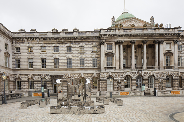
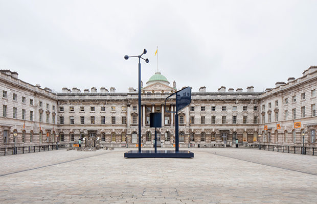
 The United Kingdom's installation outside of Somerset House | Credit - Ed Reeve Images
Design
London’s first Biennial: Serious Solutions and Even a Bit of Whimsy
To pay homage to the 500th anniversary of Thomas More’s depiction of an ideal society, London’s first Design Biennial asked teams from 37 countries to focus on the theme of Utopia by Design. Set in Somerset House, an Eighteen-century mansion overlooking the Thames, and open for twenty days in September, the Biennial’s exhibits ranged from sober to playful and plainly practical to purely artistic, making a case for design as part of the answer to just about everything.
At the sober and practical end of the scale, Belgium’s EUtopia reflected on the uncertainties facing Europe’s dream of union, while Switzerland’s team offered builders an environmentally friendly insulating material made from aerated plaster as an alternative to non-biodegradable extended polystyrene foam. At the wackier end, Taiwan’s EATopia was a table of designer cocktail snacks set in a surreally gilded forest/grotto, while South African designer Porky Hefer celebrated liberation with a collection of toothy stuffed-leather hanging chairs modeled on nature’s top predators— killer whales, piranhas, lions and crocodiles. "They welcome the inner beast to come out and play" explained curator Trevyn MacGowan of the South African design forum Southern Guild, in a catalogue note.
Between the extremes, the Mexican design team led by architect and urbanist Fernando Romero offered a deeply researched, richly creative response to the challenges of migration and Trump-style isolationism, proposing a prototype design for a new high-tech Border City to be built straddling the U.S.-Mexican frontier. Chinese architect Liu Xiaodu and his Urbanus partnership addressed related urbanization issues with a project for a future vertical city extension of Shenzhen, the boomtown across the border from Hong Kong.
Many exhibits were conscious responses to current preoccupations -- sustainability, pollution, ethnic and religious conflict, migration. Australia’s Brodie Neil showcased designer furniture made from microparticles of plastic waste harvested from the Tasman Sea. Italy’s White Flag installation had 20 designers address the Mediterranean’s grimmer harvest of drowning African and Syrian refugees.
Some also carried subliminal messages, more dystopian than utopian. Russia’s Discovering Utopia: Lost Archives of Soviet Design, superficially a celebration of revolutionary creativity, was infused with the Putin era’s nostalgia for an idealized prelapsarian past. Austria’s contribution, an exquisitely balanced suspended kinetic light sculpture, like a Calder mobile, by Katharina Mischer and Thomas Traxler (who work together under the name Mischer’Traxler), shone most brightly when perfectly static. Movement caused its lights to dim. What does that say about Austria’s present mindset?


