 Photography by MARK ROSKAMS
Design
Living the Dream
"DO YOU STILL HAVE THE PINK BATHROOM?” That’s a question residents of an early 1960s apartment building in New York’s Greenwich Village still ask each other, amused, if not bemused, by that remnant of the mid-century palette that remains in some of the units today, despite who knows how many other renovations. In 2013 the owners of the apartment shown here, believers in the integrity of period design, were looking to replace broken tiles in their bathroom, when they realized that a redo of the entire apartment would better honor the building’s original period. The ensuing project is a story of perfectly aligned sensibilities between clients, architect, and designer in creating an interior that not only honors that period but is thoughtfully, and elegantly, entirely the owners’ own.
With strong interests in art and architecture— one is a lawyer who represents museums, the other, a nonprofit arts executive— the owners bought the co-op in 2006 and just moved in. But they quickly came to understand that a mid-century apartment called for furniture of certain proportions—“it had to be carefully scaled or it would be too big,” one of them says. “My old historicist furniture just wouldn’t work here. For my partner modern furniture was part of his upbringing— his father went to Finland as a Fulbright fellow in 1962 to study with the glass designer Kaj Franck and he later designed for Russel Wright. But for me it took some getting used to. My first stop was on eBay, because I was in a hurry, and I bought some teak furniture, almost all of which is gone now. But I also began to learn about the designers.”
By the time they reached the conclusion that restoring the pink bathroom was not the way to go, they had acquired several fine examples of mid-century design, including a sofa and a chair by Hans Wegner, a cabinet attributed to Niels Otto Møller, and a rocker thought to be by Ole Wanscher. They contacted Peter Sweeny, an architect with whom they had worked before, and presented him with their vision for the apartment: “Since it is in Greenwich Village, we wanted it to seem like a place an NYU professor circa 1960 might have lived. Room for lots of books. A place for reading books and listening to music. We imagined ourselves spending hours there listening to Italian opera and astringent twentieth-century chamber music on the hi-fi.” Sweeny devised a number of modifications that better balanced the space, and he also suggested bringing in Texas-born interior designer Bachman Brown Clem, thinking that Clem’s affinity for midcentury design meshed perfectly with the clients’ vision.
He was right. “I love working with clients who bring their own collections and ideas to a project,” Clem says. And the feeling goes both ways. “I knew Bachman was the right person when I looked at his website and saw, in an album of places that inspired him, the interior of a medieval Italian church. . . . I wanted someone who ‘got’ mid-century but who could handle the fact that I like old things—including and especially Italian architecture from the Middle Ages,” one of the owners says.
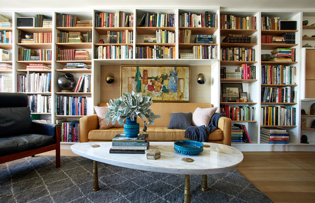
Among the first requirements were the bookshelves. “There is a famous study in Finn Juhl’s house that we came across doing Internet searches for mid-century bookshelves,” one of the owners recalls. “We thought the shelves were perfect—light but with a great deal of capacity. None of us had visited the actual house, but we used the zoom feature on our iPads and looked at lots of photographs, trying to figure out exactly what Juhl had done. We came pretty close, I think, though we elected for symmetry instead of asymmetry—and we decided that the baseboard underneath probably did not need to be orange.”
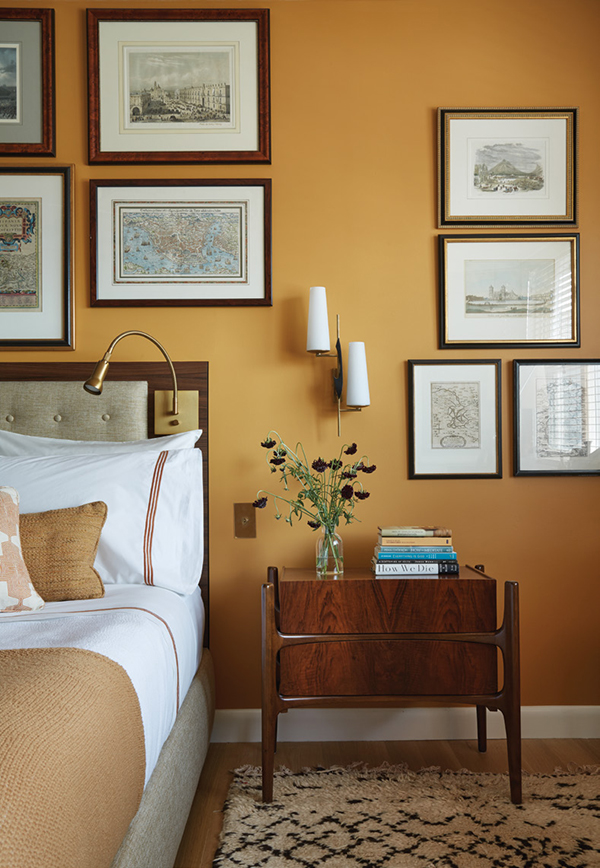
The Møller cabinet in the bedroom was the spark point for the furniture search, its beautiful rosewood, craftsmanship, and sleek lines, setting a high bar for aesthetic refinement. “My searches range from scouring the fields of the Brimfield antiques fair at five in the morning, to auction houses, to filtering through eBay or 1stdibs or other sites at all hours of the day or night,” Clem says. “I’m an addict. But I only want the really good specimens. There are a lot of cheap reproduction pieces you have to filter through.” One of his favorite finds was the rosewood hanging bar cabinet in the living room. “It’s not attributed to anyone, but the craftsmanship and the wood veining are absolutely exquisite.” Beneath it he placed a pair of Thebes ottomans by Edward Wormley for Dunbar. Other exceptional mid-century pieces they eventually found include a circa 1960 coffee table by the Monteverdi-Young Furniture Company in L.A., an Eames Aluminum Group Executive chair from Herman Miller, the rosewood dining table by Ib Kofod-Larsen, and the dining chairs by Johannes Andersen.
Despite the modern theme of the décor there are a number of objects carried over from prior apartments that reflect the owners’ interests in history and art history—an Italian Renaissance chair, carved wooden panels believed to be from Goa, a Gothic revival sconce in the bedroom, and numerous framed vintage maps, photographs, and prints, most reflecting their extensive travels. To tie it all together Clem and his colleagues at Bachman Brown Design worked out an updated mid-century palette of rusts, golds, and dusty blues with unexpected bursts of color, such as the turquoise Bitossi ceramics, the lacquer-red interior of the hanging bar cabinet—or the orange that went into the kitchen. “We needed a surprise in the palette,” Clem says. A 1960s orange ceramic mirror by the partner’s designing father provided just the right inspirational jolt for the kitchen.
One would never mistake this interior as actually one of the 1960s. Instead it is a “midcentury space in which history is always at the center,” says the owner. “The Bitossi pottery— something that Bachman introduced us to—has echoes of Byzantium. The book-matched rosewood veneers evoke Biedermeier and other neoclassical furniture. The marble coffee table suggests Rome as seen from the Hollywood Hills. For the kitchen counters, there was no choice but terrazzo—one of the quintessential Roman materials.” The bathroom, too, now conjures the Roman theme. Gone are the pink tiles, replaced by blue glass mosaic tiles evocative of ancient baths—though inspired here by the tiles in Eero Saarinen’s kitchen of the Miller House in Indiana.


