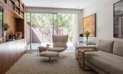
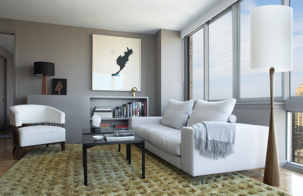
 Morgan O’Hara’s Portrait for the Twenty-First Century number 76, 1982, hangs in the living room. To the left of the Lightpiece sofa by Flexform is a c. 1950 spindleback lounge chair by an unknown Brazilian designer. A pair of Kiki low tables by Artek stands atop a silk rug by Sacco Carpet.
Design
Form, Function, and Finesse
APPARENTLY NO ONE LIKES to be called a minimalist. The word was popularized in the mid–1960s as a way to describe the austere art of Donald Judd and Dan Flavin, and they both despised the term. New York interior designer Magdalena Keck is labeled a minimalist in a new book about her work—Pied-à-Terre: Magdalena Keck (G Arts)—and she doesn’t much care for the word either, though she understands why someone might use it. “There’s nothing arbitrary in the spaces I create; everything is logical and systematic,” she says. “It’s conceptual, but it’s also impressionistic. Within the system there’s freedom, there’s room for artistry.” A blend of artfulness and practicality has been a keynote of Keck’s working life. She studied art in her native Poland and envisioned a career as a painter. But on a trip to New York in 1993 she fell in love with the city and decided to move there. She quickly reached another decision: that the life of a starving artist was not for her. Keck settled on interior design as a path that “would allow for creativity, but also pays money.”
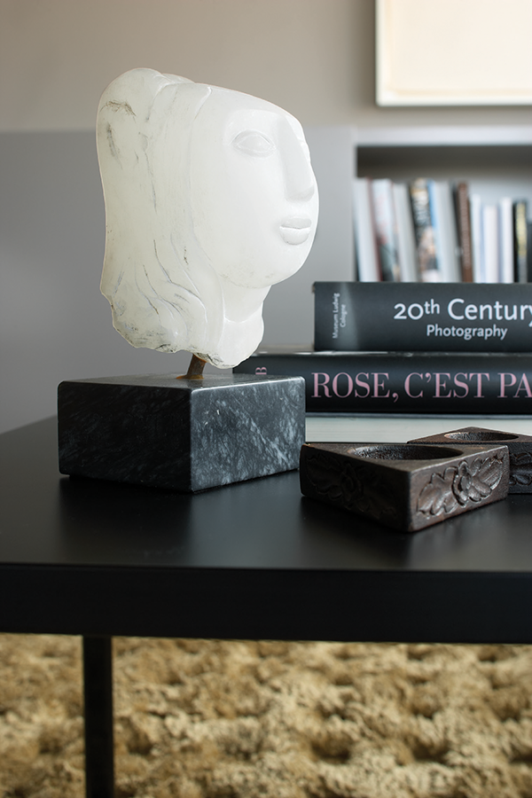
The carved alabaster sculpture by Lorrie Goulet is titled GJu-ju, 2002.
She received a BFA in interior design from the Fashion Institute of Technology and got her first job with a firm that concentrates on retail spaces. Retail is the area of interior design where form most closely follows function, and Keck says she gained a sense of structure and discipline from the work. After five years with the company—and a shorter stint with a practice that designs corporate offices—Keck set out on her own in 2003. She initially focused on retail work and restaurants, until a longtime client who owns a chain of specialty food stores asked her to design his apartment. “I discovered that I loved residential work,” Keck says. “The client’s personality becomes an inspiration. Something emotional happens to the design.”
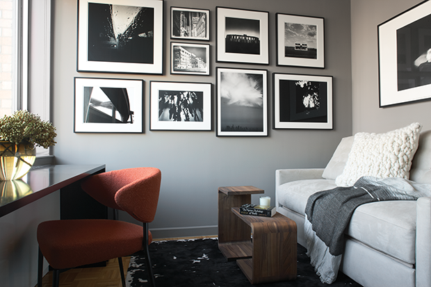
Photographs hung salonstyle decorate the guest room/office. On the left, a custom black lacquer desk designed by Magdalena Keck is paired with a Minotti Mills chair; at the right are Waiter, Waitress tables by Formstelle for Zeitraum. The silk rug is by Tai Ping.
A two-bedroom apartment on Manhattan’s Upper West Side offers a perfect example of the way the rational and the emotive come together in Keck’s work. At first glance, the spaces seem subdued, almost ascetic—the gray walls, neutral-colored fabrics, the complete lack of clutter. “Almost every piece I select has a certain presence, and it needs space to breathe,” Keck says, explaining the careful arrangements of objects and furniture.
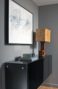
A Milo Baughman designed lacquered buffet with Lucite sides stands below a 2002 work from Morgan O’Hara’s Live Transmission series.
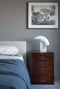
In the bedroom, a Biagio table lamp by Tobia Scarpa for Flos sits atop an Edward Wormley nightstand. The photograph is Grant Miller’s Pigmy Island, 2012.
But then you notice the warm textures of the silk rugs, the deep upholstery, the linen-covered dining chairs, and a leather-clad table lamp. Your eyes land on interesting sculptural forms—a lacquered-brass table of Keck’s design, Tobia Scarpa’s marble Biagio lamps—and the way art and photography is hung salon-style, as if groups of works are having a conversation. The effect becomes one of, for lack of a better word, friendliness. You want to know about these things.
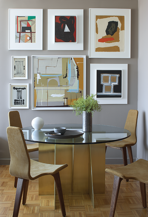
Four linen-covered Tapas chairs by Matthew Hilton for De La Espada are gathered around a custom table designed by Keck. The art on the wall includes works by Sidney Geist, Larry Lee Webb, James Kennedy, and others.
Keck suggests that it’s all a result of an unthinking artistic sensibility. “When you paint, you are working with shapes. I look at a space as if I were composing a painting—subconsciously,” she says. “You see where the light enters, how it highlights the space, you organize the way surfaces absorb or reflect the light.” But at the same time, Keck says, she remains fully conscious of her clients’ needs: “I want them to feel good in their home. It’s their sanctuary. We’re all so busy, we’re running around all day. When we come home we want to feel content.”


