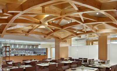
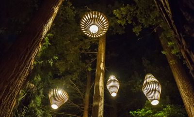
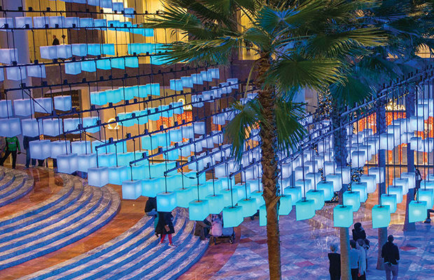
 In celebration of the holiday season, last winter the Lab at Rockwell Group was commissioned to create Luminaries, an interactive lighting installation composed of 650 lanterns that hung in an undulating wave-like form from the ceiling of the Winter Garden at Brookfield Place in Lower Manhattan. | THE LAB AT ROCKWELL GROUP/ARBUCKLE INDUSTRIES PHOTO
Architecture
Design’s Polymath
ARCHITECT, SET DESIGNER, DIGITAL INNOVATOR, and product designer are just a few ways of describing David Rockwell. His multifarious approaches have expanded and redefined the architectural practice to encompass a remarkable breadth of projects that stretch from buildings and furniture to theater sets and virtual environments. Yet all share a common denominator: creating unique spatial experiences that change and enhance people’s relationships to their surroundings.
Since establishing his eponymous firm in 1984, Rockwell has been the force behind some of the most visually enticing and high-profile restaurants and hotels, including several Nobu locations, nearly half a dozen W hotels around the world, and the Cosmopolitan in Las Vegas. More recently, he helped breathe new life into The Time hotel in New York’s Times Square with a sleek makeover, and collaborated with Ian Schrager to convert the landmark Metropolitan Life Tower into a hotel, gracefully updating the interior with modern flourishes all while preserving the historic fabric of the original building.
It has been an action-packed year for Rockwell. In June, he received a Tony Award for Best Scenic Design for his meticulously designed art nouveau period set for the musical She Loves Me. And only a day or so later, his Rockwell Unscripted for Knoll—a flexible furniture collection of over thirty products envisioned for today’s workplace culture—was unveiled at Neocon in Chicago. This past winter, the Lab, Rockwell’s design innovation studio, transformed the glass atrium of the Winter Garden at Brookfield Place in downtown Manhattan with Luminaries, an interactive installation of 650 glowing lanterns.
Guided by tireless curiosity and a drive to conceive new architectural experiences—whether through fostering educational tools with his children’s playground equipment system, Imagination Playground, or the forthcoming Culture Shed in Hudson Yards (designed with Diller Scofidio + Renfro), a new multiuse venue for the visual and performing arts, media, and design—Rockwell designs spaces and products that never cease to delight with their sophistication and warmth, and always a touch of theatrics.
Revamped historic hotels, striking restaurant interiors, creative shared workplace hubs, public spaces for children’s imaginations to run wild, luxurious spa getaways, and new and electrifying virtual realms make up David Rockwell’s ever-expansive oeuvre, and without a doubt, this is just the tip of the iceberg.
Nicole Anderson/MODERN Magazine: First off, congrats on the Tony Award for Best Scenic Design for She Loves Me. The set is beautiful, and strikingly captures the period with its incredible art nouveau details. Could you tell me about the process of designing the set, and how you conceived the design?
David Rockwell: For any project, and particularly in set design, we start with a great deal of research. She Loves Me is set in 1930s Budapest, so we immersed ourselves in art nouveau. It is really such a fascinating design vocabulary because it’s right where the rigid nineteenth century academic historical revival was moving towards twentieth century modernism. In addition to looking at art nouveau, we did a lot of research on places we love to shop. The French patisserie Ladurée uses a particular lavender I’ve always loved, so we used a similar shade of lavender as an idea for the outside of the store.
Then we wanted to find a way to capture the story itself and the play between the inner and outer lives of Georg and Amalia—something about what feelings they reveal and keep hidden. So we came up with the idea of a set that could seamlessly transform from inside to outside. The focus of the set is Maraczek’s perfumery. It’s in a constant state of transformation—opening and closing, revealing and concealing, in an alternating rhythm, almost as if it’s dancing to the rhythm of the score.
MM: You’ve done a wide range of sets, from Catch Me If You Can to the Rocky Horror Picture Show. What was unique or challenging about creating this particular set?
DR: Coming up with the right geometries and mechanics for the perfumery’s transformation multiple times was a huge challenge. Each rotation had to be done in less than 20 seconds, and all movement takes place in full view, so transitions had to be seamless. Also there’s very little wing space on the Studio 54 stage. We solved that by having all the pieces move in circular motions from the sides in. All of the mechanics and stage elements had to fit together in multiple configurations.
MM: Moving on from three-dimensional sets to the virtual, the Lab at the Rockwell Group created a transfixing lighting display at the Winter Garden at Brookfield Place in downtown Manhattan this past winter. What was the inspiration behind this project?
DR: The holiday season is so much about sharing traditional moments with families and friends, and about the gesture of giving and receiving that marks generosity and good will. The Lab spent months researching festivals around the world that involve the use of light, lanterns, and color as a shared gesture to celebrate, mark respect, and make a wish. For example, the beautiful Yi Peng Lantern Festival in northern Thailand, where hundreds of candlelit lanterns are launched into the air as an act of giving. We also thought about how the artist James Turrell uses light to create immersive spaces that tap into our emotions.
MM: The Lab has been a unique platform for employing the latest in digital technology to create engaging architectural experiences. How has it impacted and expanded the possibilities of your practice?
DR: In all of our projects, we want to create a seamless integration between story, space, and technology. The Lab at Rockwell Group helps us use technology as a material for imagining and forming physical spaces. It allows the Lab to create spaces that react to the people around them, but also create a degree of interaction that feels personal and direct. The use of technology has gone more and more from passive to active, where people use technology to directly engage with the space.
Whether using headsets for both augmented and virtual reality, or simply immersive environments— so designers can gain new and different perspectives about the scale and spatial relationships of their projects—we are changing the perception of the world around us and what is categorized as “real.” The Lab is integrating these technologies into our practice to demonstrate more unique and abstract ideas to clients, and to push the boundaries of what can be done with physical space by enhancing comprehension in the virtual world.
MM: What are some new projects coming down the pipeline from the Lab?
DR: The Lab at Rockwell Group is working on a retail and entertainment complex in Cotai [in Macau] and this season’s Luminaries installation at the Winter Garden. They also just finished 605 Third Avenue, a lobby environment that instills moments of reflection. Two oversized digital glass windows comprised of a grid of LCD tiles flank the entry and transform the lobby into an inhabitable kaleidoscope.
MM: You just collaborated with Knoll to produce Rockwell Unscripted. How does this collection rethink the workspace?
DR: We worked with Knoll to understand the massive change in the workplace and how those changes are trending in public and private spaces. Employees are looking to be in spaces that are not coded “office” as they are now, having more conversations and connecting throughout the day. People need work environments that are fluid and inspired by social spaces, infused with flexibility and comfort.
That quality of the workplace led us to develop a range of products that encourage community and connection. We’ve created building blocks that empower workers to transform their own environment, create spaces that support a multitude of tasks, and invite situations for serendipitous meetings. From an oversized library table for group brainstorms to soft and hard seating and easy-rolling tables, the 30-pluspiece collection can form different ecosystems for a range of different work environments.
MM: You’ve been a pioneer in restaurant design with such eateries as Nobu. Could you tell me about your approach to these types of projects?
DR: We approach each project by trying to spend as much time understanding the client— the location, his goals, his dreams—so that we can create a narrative. It’s fascinating for us to learn the stories of our clients and develop those stories into environments that extend and craft the narrative.
For Nobu, we were inspired by chef Nobu Matsuhisa’s innovative cooking and the culture of the Japanese countryside where he grew up. All Nobus combine rich and tactile design with his personalized craft; careful attention to natural materials, texture, finishes, experimentation, storytelling, and restaurant and theater design.
MM: You’ve also worked on a number of luxury hotel brands and boutique hotels, including several W locations and the Round House at Beacon Falls. Could you tell us about your latest projects, and what is particularly compelling about designing hotels?
DR: I think hotels will continue to evolve from places to stay into fully-realized experiences that meet the needs and interests of a wide array of travelers. In terms of hotel design, people are no longer interested in one-size-fits-all design, and this presents exciting design opportunities. The growing demand for experiential spaces will push us as architects to design lobbies, amenities, and guestrooms that reflect their local surroundings and that are also flexible and transformative.
Last year, we completed the design of the New York Edition hotel. It’s located in the Metropolitan Life Tower, a landmarked building overlooking Madison Square Park. We also recently completed a renovation of The Time, a boutique hotel off of Times Square. We are currently working on Nobu Eden Roc, our second Nobu Hotel in the United States. It is located in a landmark building in Miami designed by Morris Lapidus in 1955. Our design will maintain Eden Roc’s classic mid-century heritage and design and layer it with Nobu’s signature Japanese style.
MM: Is there anything you would like to pursue that you haven’t tried yet?
DR: I would love to design a large urban park. Parks are some of the most powerful places for people to connect. But I’ve always questioned why their permanent infrastructures cannot transform to accommodate a much wider range of temporary and even spontaneous activities. It would be interesting to design a public park that disrupts the relationship between the planned and the spontaneous and creates a new form of park experience.
MM: So many architects or designers become one-trick ponies, limiting themselves to the confines of what feels comfortable or what has worked well for them before, while you constantly experiment and push your practice into new and different realms, whether it be public works with Imagination Playground, product design with lighting for Rich Brilliant Willing, or workplace design like the Neue- House. What is the impetus behind this exploration? And is there a thread that connects these different areas of interest?
DR: Our studio does not have a “signature” style, as that would be a straightjacket for me. Design at its core is an exhilarating journey that should have a destination with impact, where knowledge and intuition weave together to create a new fabric every time. For me, design has to be accessible, easily understood, or experienced either directly through some form of reasoning or emotionally as something felt. More than anything, we strive in every project to create opportunities for people to connect and share experiences.
I’ve always been driven by curiosity. The most exciting projects are those where you have no idea of the solution at the outset. We’re always seeking to take on unfamiliar project types, which allow us to constantly evolve, change, and push the boundaries of our design practice. Since childhood, I’ve always thought of theater as an extraordinarily impactful art form. Theater provides a source of inspiration for all my projects, whether it’s an airport or museum exhibition. In many of our projects, we take concepts uniquely rooted in theater and apply them to architecture and interior design. The addition of the theatrical to an architectural space enhances that relationship, greatly increases the communication between the space and those who visit it, and makes the architecture come alive.
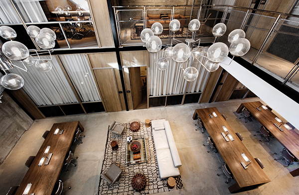
Rockwell recently designed NeueHouse’s West Coast flagship in Hollywood (he also designed the New York City location)—the chic workplace collective for entrepreneurs and creative companies which occupies six floors of the historic CBS Radio Building and Studio, originally designed by William Lescaze. As seen here, double-height conference stack cluster meeting rooms are organized around a central lounge, with mesh balustrades on the second floor. | EMILY ANDREWS PHOTO


