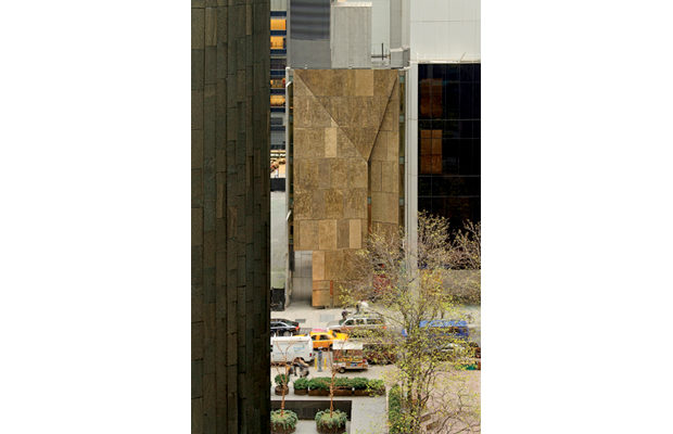
 Photography by Gavin Ashworth
Architecture
An Almost-New Landmark in Peril
The Case for Saving Both Facade and Spaces
Reaction to the Museum of Modern Art’s plan to demolish its one of its recent acquisitions, the erstwhile building of the American Folk Art Museum (AFAM), couldn’t be louder or clearer. So loud and clear that MoMA may yet decided to revisit its decision to raze the building, with one possible option being to preserve the building’s West 53rd Street facade. The panels of Tombasil (an alloy of copper, zinc, manganese, and nickel), molded against deeply rutted planes of steel and concrete, are the best-known feature of the twelve-year-old building by Tod Williams and Billie Tsien.
And many lovers of the museum—including even architecture critics—would applaud the compromise, a face-saving move in more ways than one. As Julie V. Iovine wrote in the Architect’s Newspaper, “Preserving the AFAM—even if only the facade—would allow the museum the chance to provide a more expansive and more accurate picture of modern architecture.” Iovine was referring to the preservation of the facade in its present location, where it would become part of MoMA’s expanded glass street wall. (That wall already contains a facade—the translucent glass grid created in 1939 by Edward Durell Stone and Philip L. Goodwin—that was saved while the building behind it was demolished.) Others have called for displaying the facade elsewhere—the museum’s famous sculpture garden or its enormous atrium.
But architecture is about spatial relationships as much as exterior materials. And the Folk Art Museum building contains a tapestry of rich and varied spaces. (Tellingly, the knowledge that AFAM could never expand beyond its narrow site freed Williams and Tsien to create a fully realized work of architecture—not, like many museum buildings, a “phase” in a multi-decade master plan.)
Moving through the complex spaces, it’s easy to forget that they are squeezed between windowless walls a mere forty feet apart. A rectangular “well” topped by a large skylight bisects the building. Suspended in the opening is a wall of blue-green resin, which stands out sharply from the otherwise neutral palette and becomes a kind of locating device, beckoning visitors back to the center of each floor. Museumgoers were advised to take elevators to the top floor, then work their way down, Guggenheim-style; but unlike the Guggenheim, AFAM offered multiple itineraries, via three radically different stairways. As Williams said at the time the building opened, “Knowing that there are routes other than the one you’ve taken should make you want to come back.” The smallest of the stairways darts behind partitions. “We’d like you to remember it,” said Tsien, “but not be able to recall exactly where it is.
Other features were as compelling as the layout. With exposed concrete slabs visible overhead, underfoot, and—where stairs cut through them—in cross-section, the building was a lesson in robust materiality. And installation designer Ralph Appelbaum mounted a giant metal weather-vane in one stairwell, then lit it so that its shadows fell onto surrounding walls—making those otherwise blank surfaces compelling “displays” of folk art, in silhouette.

If the museum is torn down, its rooms will share the fate of several other important interiors, including an auto showroom by Frank Lloyd Wright on Park Avenue that was gutted, unceremoniously, early this year. The law is little help in cases like this—it’s rare for an interior to have official landmark status—but that is no reason for enlightened clients to destroy spaces that exemplify what architects do best.
Bottom line: The American Folk Art Museum is important, both as a building and a precedent. The design community should not accept any compromise that saves the facade, without saving the building behind it.


