 Photography by MARK ROSKAMS
Feature
Living with Art
THIS IS A STREET with a storied history. More than a century ago, before Manhattan had moved uptown, it was home to stables, a mill, a warehouse, and empty lots. Then, in the first three decades of the twentieth century, the block of West 67th Street between Central Park West and Columbus Avenue became home to artists, dancers, musicians, and writers—among them Childe Hassam, Isadora Duncan, Henry Ward Ranger, Noël Coward, and Fannie Hurst. They lived, mostly, in four famous studio buildings, including the renowned Hotel des Artistes, a Gothic limestone structure with double-height windows and gargoyles depicting painters, writers, and sculptors on its facade. In 1985 the block was designated the West 67th Street Artists’ Colony Historic District by the National Register of Historic Places.
One of these landmarked buildings, 40 West 67th Street, was designed in 1928 by the fashionable architect Rosario Candela. The units on the second through ninth floors have leaded-glass windows in the living room as well as working fireplaces. The lobby is of a Moorish design, with wooden entry doors, Spanish ceramic tiles, and stained glass windows. The theme continues with pointed archways in the apartments’ foyers and hallways. The co-op building has just forty units, giving it an intimate feel.
Brett Littman, director of The Drawing Center, and Kara Vander Weg, a director at Gagosian 980 Madison Avenue, had been living in Brooklyn, but almost every evening both were attending five or six art-related events in Manhattan, prompting their decision to leave their art-filled contemporary Carroll Gardens duplex in The Mill building. The couple started looking downtown, but they both fell in love with an apartment at 40 West 67th Street. “It’s one of the most beautiful blocks in New York,” Littman says, “and the apartment had the kind of prewar details that were really appealing to us.”
“Candela was a genius in terms of laying out the rooms,” adds Vander Weg. “All of the bedrooms are placed so that there’s no ambient noise from other apartments at all.” Another reason the apartment was so attractive is that it was turnkey ready—though the couple is planning to return the renovated kitchen and bathrooms to their original 1929 style. The move also meant that Littman and Vander Weg needed to pare down their considerable collection of art, furniture, and vintage tableware. “I think we have enough art to fill three apartments this size,” Littman laughs. “When we bought the apartment, I spent a fair amount of time drawing in to scale all the various pieces of furniture to see what would fit.” He ended up selling many pieces from his modernist furniture collection, including Eames chairs, a Knoll couch, and an Arne Jacobsen Swan chair.
The couple didn’t want a minimalist look; they were going for cozy, but they didn’t want the 1,100-square-foot space to be overwhelmed with art and objects. Working in the art world gave them the skills to curate their collection. In the foyer, American Modern and Iroquois ceramic pitchers and bowls designed by Russel Wright top an Eames credenza; the shelves are adorned with pieces from Eva Zeisel’s Red Wing collection, a set of ’60s Swedish ceramic pots, coffee and tea servers, and glass bowls from Iittala. Above it hang the twenty-one- color lithograph Course of Empire by Ed Ruscha and Corner Neon, a graphite and colored- pencil drawing by Stephen Antonakos.
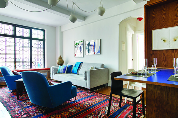
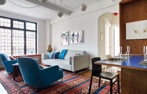
The foyer archway frames the floor-to-ceiling leaded-glass windows in the living room. Centered around the fireplace are a couch and two chairs in custom fabrics from Ligne Roset, Syrian side tables, and a vintage kilim rug—all adding color and warmth to the room. Above the couch are two color lithographs, both untitled, by Ray Parker, and above the fireplace, Carbon Drawing No. 9, created with soot from an acetylene torch by Norman Mooney. Littman and Vander Weg like to entertain at home. “Brett is the chef and I am the baker,” Vander Weg says. “We have a large collection of ’50s plates and bowls we like to serve on, and quite a bit of vintage glassware.” They came up with an ingenious solution for adding a dining table that seats eight, as well as storage for their dinnerware: a “Murphy” table on the other side of the living room. The wooden cabinet that hides a fold-down table houses a rolling wine cart that functions as a support for the table when it’s open. Littman designed the unit with Pat Keesey Furniture and Design, researching art deco and 1930s decorative arts and furniture to get the right look. Above the table is a drawing by Marco Breuer, Study for 110, made by exploding firecrackers on handmade paper.
Both the master bedroom and guest bedroom are art-filled. An editioned print titled Language Is Not Transparent by Mel Bochner was produced by Dieu Donné Papermill in SoHo, where Littman had been co-executive director. Also in the second bedroom, which doubles as the couple’s office, is a poster with multiple images of Benito Mussolini by artist C. T. Jasper, based on 1950s Polish poster designs. The master bedroom holds many interesting pieces—atop the Conant Ball dresser are a music box by Douglas Gordon made from a plastic skull and a glass stone by Arlan Huang, and above it, a print from John Currin’s Milestones portfolio.
The first work of art that Littman ever bought is a vintage Olympia typewriter poster from the 1930s, and it’s now positioned above the Jean Prouvé table in the kitchen where the couple usually takes their meals. Their favorite dishes are from the Frosty Pine set by Tamac Pottery, of which they especially relish the coffee cups with the thumb insert.
A true act of creativity, Littman and Vander Weg’s home reflects their taste and knowledge of art and mid-century furniture, ceramics, and glass. There is just enough to complement the architecture and history of the space, with both contemporary and vintage pieces. One of their favorite things about the apartment? The location. Littman says, “walking home from the subway is really a pleasure. The street makes it feel like you’re stepping back into the early twentieth century.”


